Alternative estimates of turnout for the Irish General Election 2024
Author: Thomas Däubler
Date: 17 January 2025
Based on voter numbers on the electoral register, the widely reported estimate of turnout in the 2024 Irish General Election was 59.7%.1 The lowest figure in decades, it sparked widespread public discussion about the underlying causes. One frequently mentioned technical issue is the overestimation of eligible voters on the electoral register, as it includes individuals who have moved away or passed away.2 However, the severity of this issue, its variation across constituencies, and its impact on constituency-level turnout patterns remain largely unclear. This post aims to address these questions by approximating the number of eligible voters using publicly available data from Census 2022.
To be eligible to vote, individuals had to be Irish or UK citizens aged 18 or older on election day. To estimate the number of such persons for each constituency, I follow several steps. First, I draw on census-based figures for the total population of each constituency, as also used in the (opens in a new window)Constituency Review Report by the Electoral Commission. Second, the (opens in a new window)Oireachtas Constituency Dashboard provides data on citizenship and age cohorts for each constituency. Combining these sources enables me to estimate the number of Irish or UK citizens aged 15 or older on Census day in 2022. I then adjusted this figure downward to account for individuals who had not yet reached voting age by election day in 2024.3 Third, I modify this population estimate to account for deaths occurring between the census and the election, a factor that varies across constituencies due to differences in age profiles. Using data from the (opens in a new window)Central Statistics Office (CSO), I approximate mortality rates for three age groups (15–64, 65–74, and 75+) during the relevant period and adjust the constituency-level figures accordingly.4 Information on registered voters and turnout figures comes from (opens in a new window)Elections Ireland.
This procedure is not without limitations. It relies on certain assumptions,5 is constrained by the data currently available, and does not quantify the uncertainty in the estimates. Nonetheless, it provides a “well-informed guess” about the number of surplus voters on the register and its implications for turnout.
The results of this analysis are presented using several graphics. Figure 1 compares the number of registered voters with the approximated number of eligible voters, with each point representing a constituency. The graph clearly shows the presence of surplus records, as the number of registered voters exceeds the estimated number of eligible voters in nearly all constituencies. However, there is also some positive news: the two measures are strongly correlated. The Pearson correlation coefficient is approximately 0.97, indicating that most of the variation in the register figures can be explained by the variation in the approximated number of eligible voters.6
Figure 1: Clear evidence for excess records on the register
Note: Blue line represents a linear regression fit with 95% confidence interval.
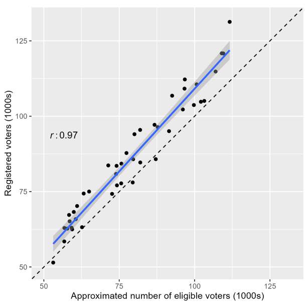
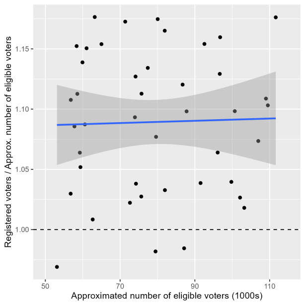
Figure 2 provides a slightly different perspective on the same data by showing the ratio of registered voters to eligible voters on the y-axis. Values larger than one imply an overestimation in the register, values below one an underestimation. Across the 43 constituencies, the mean ratio suggests an overestimation of 8.9%. The middle 50% of the distribution falls between 3.8% and 13.6%, while the four highest values range from 17% to 18%, occurring in Cork South-West, Donegal, Dublin Bay South, and Sligo-Leitrim (listed alphabetically). The nearly flat linear fit line indicates that overestimation does not systematically vary with the size of the electorate.7
Figure 2: The overestimation rate does not systematically vary with electorate size
Note: Blue line represents a linear regression fit with 95% confidence interval.
At the national level, the results estimate that the number of registered voters exceeds the approximated number of eligible voters by approximately 305,000, equivalent to an overestimation of 8.96%. However, this comparison only considers absolute numbers. In reality, not all eligible voters are registered, meaning the actual number of surplus records is higher.
What are the implications for estimated turnout? Using the approximated number of eligible voters, nationwide turnout is recalculated at 65.07%, a difference of 5.35 percentage points compared to the register-based figure of 59.72%.
Next, let’s examine the constituency-level figures. One potential concern is that surplus records on the register might systematically distort reported turnout rates, making constituencies with more excess records appear to have lower electoral participation. Figure 3 explores this relationship, showing how reported turnout rates vary with the surplus ratio (dashed lines indicate the means of both variables).
If this concern were valid, many constituencies would cluster in the top-left quadrant (low overestimation, high turnout) and the bottom-right quadrant (high overestimation, low turnout). However, this pattern is generally not observed. In fact, the linear association between the two variables is slightly positive, indicating that overestimation is associated with higher reported turnout.
That said, there are some notable exceptions. The constituency with the lowest nominal turnout rate (Dublin Bay South) and the one with the highest (Wicklow) also stand out for having particularly high and low levels of surplus records, respectively.
Figure 3: No strong association between overestimation and turnout level
Note: Dashed lines represent means, the blue line a linear regression fit.
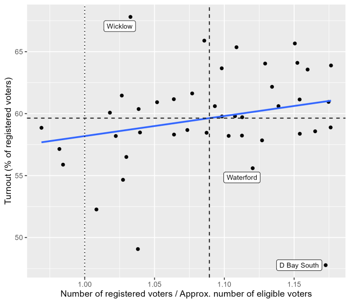
Figure 4 compares constituency-level turnout rates based on the approximated number of eligible voters with those calculated using the register data. The alternative turnout rates are almost always higher, in some cases significantly so. Based on the new figures, Tipperary North and Cork South-West top the turnout league table, with more than three out of four eligible citizens casting their vote in these constituencies. In contrast, the result for the former front-runner, Wicklow, now appears less exceptional. At the lower end of the spectrum, Dublin Bay South has made a notable leap, handing over the “red lantern” for the lowest turnout to Dublin South Central.
Figure 4: Considerably higher turnout based on the alternative approach
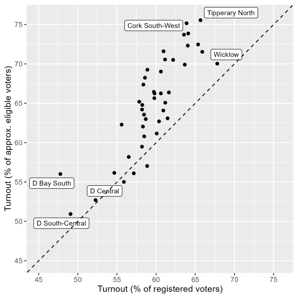
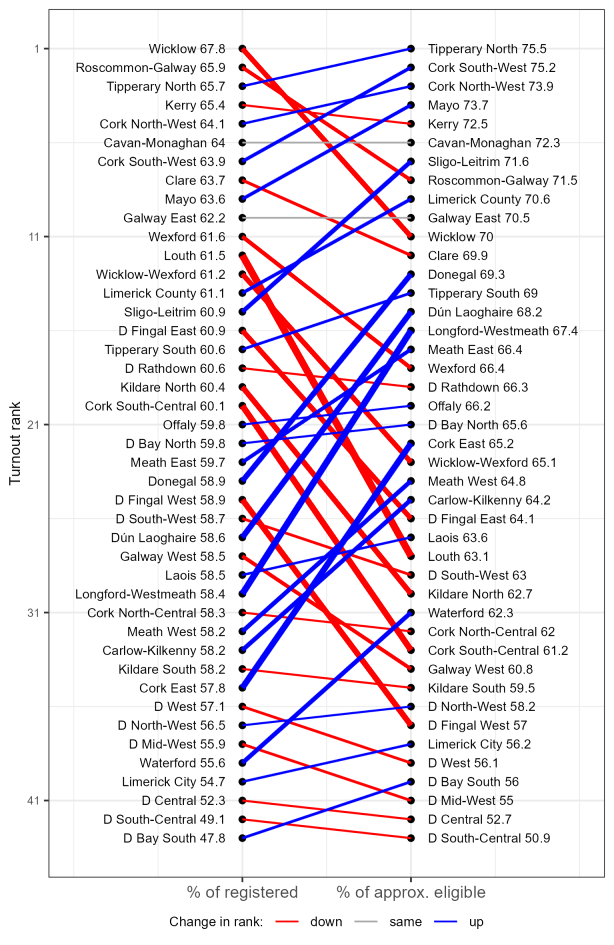
Figure 5 provides a full list of results, ranking constituencies according to the two turnout measures. The colour and width of the lines indicate changes in the relative positions of the constituencies. While the alternative measure generally suggests higher absolute turnout rates for most constituencies, some drop several positions in the ranking. However, it is important to note that these rank differences may sometimes reflect only minor differences in absolute values.
Figure 5: The turnout ranking also changes
Note: The width of the line is proportional to the absolute change in rank.
This raises the question of whether the alternative turnout measure is better than the original measure based on register data. One way to answer this question is through what social scientists call an assessment of construct validity: If we assume a well-established hypothesis about the relationship with another variable, does the new measure demonstrate a stronger form of this relationship than the existing one?
A prominent argument in research on electoral participation is that turnout is partly driven by top-down mobilization. Candidates aiming to win elections invest time in campaigning, which in turn motivates citizens to vote. Stronger electioneering incentives are expected in more competitive electoral contexts, which should lead to higher turnout. In Ireland, the close relationship that candidates have with constituents suggests this is at play.
Electoral competition intensity across constituencies can be measured in various ways. Here, a post-hoc approach is used to assess the degree of competition, considering the eventual electoral performance of candidates. Building on the idea that candidates typically need preference votes amounting to around half of a Droop quota to secure a seat, I calculate the ratio of candidates polling more than 0.4 of a quota to the number of seats in the constituency.8 This provides a measure of how many strong candidates are competing for each seat.
Figure 6: Clearer association between competitiveness and turnout using the alternative measure
Note: Blue line represents a LOESS-smoother with 95% confidence interval.
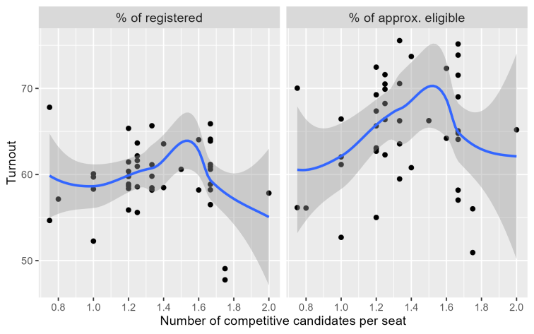
To assess the two turnout indicators, Figure 6 compares their scatterplots against the measure of competition, with a non-parametric smoothing line added to clarify trends. There are a few surprising findings in this graph: the competition ratio is sometimes less than one, indicating that in some constituencies, candidates with less than 0.4 of a quota ultimately win a seat. Additionally, the relationship between the two measures is not linear but follows an inverse U-shape, with turnout declining again at very high values of the competition ratio. This could reflect that candidates near the 0.4 threshold may have weaker campaigning incentives if they face many stronger competitors, or it could suggest some reverse causality (where lower turnout makes it easier to surpass the 0.4 quota).
However, the most interesting takeaway for the purposes of this post is that for competition ratios between 1 and 1.5, there is a stronger positive association with turnout based on the approximated number of eligible voters than with the register-based measure. This suggests that the alternative approach indeed offers a better measure of turnout: for a relationship that we expect on theoretical grounds, it shows a clearer association.
In summary, this contribution has demonstrated that the electoral register includes many surplus records, and this overestimation has significant implications for turnout estimates. The results underline the importance of the ongoing efforts to improve the electoral register.
Acknowledgements
The author would like to thank staff of the Central Statistics Office and the Houses of the Oireachtas Service for very helpful information about data.
About the author
Thomas Däubler is an Assistant Professor and Ad Astra Fellow in the School of Politics and International Relations at University College Dublin.
1 For example, on the websites of the (opens in a new window)national broadcaster and a (opens in a new window)major newspaper.
2 See, for example, (opens in a new window)here.
3 This was done using data from the CSO by calculating the share of 15-year-olds within the 15-19 age cohort and incorporating information on the distribution of birthdays.
4 This analysis relies on data from the CSO, including deaths recorded for the relevant period in 2022, provisional data on registered deaths from 2023 to June 2024 (with adjustments based on overlapping earlier data), and an assumption of similar numbers for the remaining period (July 2024 to the end of November 2024).
5 For instance, this method does not account for immigration and emigration of eligible voters. However, this issue is unlikely to have a significant impact, as CSO data suggests that immigration and emigration of Irish or UK citizens have been relatively balanced (at least at the national level) between 2022 and 2024.
6 The concordance correlation, as a more direct test of agreement, is about 0.90.
7 What does seem to matter is the age profile. In a linear regression, the share of people aged 75 years or older explains approximately 40% of the variation in the overestimation rate.
8 The Droop quota is the number of votes divided by the number of seats increased by one. In the Irish Single Transferable Vote electoral system, any candidate eventually exceeding this quota is elected.