# This is a chunk of R code. All text after a # symbol is a comment
# Set working directory using setwd() function
setwd('Enter the path to my working directory')

# Clear all variables in R's memory
rm(list=ls()) # Standard code to clear R's memoryData Distributions
A tutorial about data analysis using R (Website Version)
How to Read this Tutorial
This tutorial is a mixture of R code chunks and explanations of the code. The R code chunks will appear in boxes.
Below is an example of a chunk of R code:
Sometimes the output from running this R code will be displayed after the chunk of code.
Here is a chunk of code followed by the R output
2 + 4 # Use R to add two numbers[1] 6Objectives
The objectives of this tutorial are:
- Introduce the concept of a distribution
- Distinguish between empirical and theoretical distributions
- Introduce the normal distribution
- Summarise a distribution using central tendency, spread and skew
- Introduce the central limit theorem
Introduction
This tutorial introduces the idea of a distribution. We will look at the distribution of the human height observations for woman from the HEIGHT.CSV data file and the distribution of cortisol levels in wolves from the WOLF.CSV data file.
We will also look at an important theoretical distribution, the normal distribution, and introduce the central limit theorem to explain why the normal distribution (a theoretical distribution) is so often used to analyse real data.
To start with we will import the data from the HEIGHT.CSV file and extract just the data for females.
# ************************************
# Import  data ------------------------

human = read.table('HEIGHT.CSV', header=T, sep=',') # Import human height data
humanF = subset(human, SEX=='Female')               # Extract data for females
And the data from WOLF.CSV
wolf = read.table('WOLF.CSV', header=T, sep=',') # Import wolf data setWhat is a distribution?
What is a distribution?
Review this online lesson about distributions before continuing.
This lesson is athttps://www.ucd.ie/ecomodel/OnlineLessons/lesson3_distributions_Website.html
Examples of distributions
1: Will it rain tomorrow?
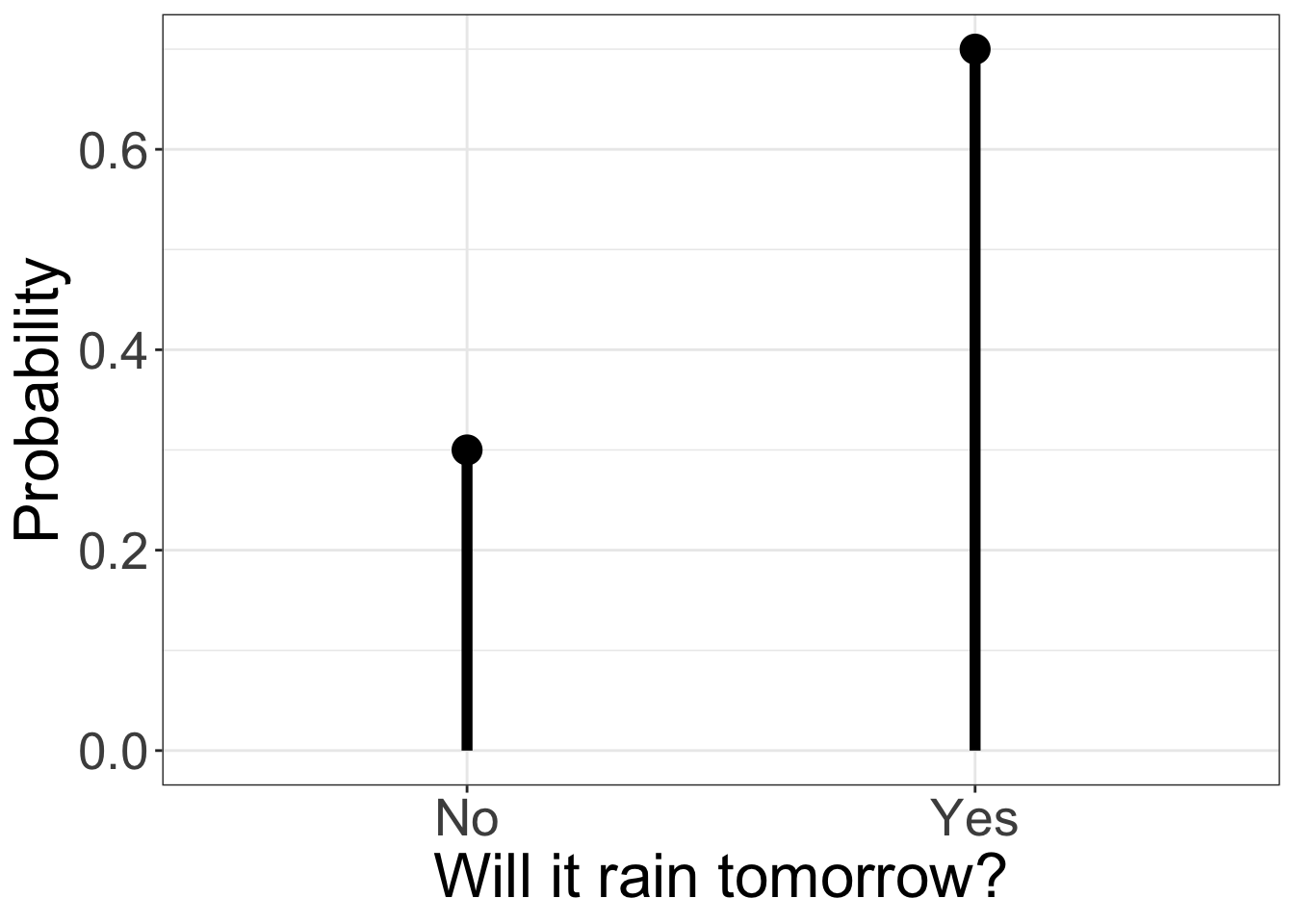
The answer to this question is unknown. There are two possible outcomes: yes it will rain, no it will not rain. Although a definite answer is not possible, stating a distribution of outcomes is possible if we can estimate the probability of the two outcomes (the two probabilities must add up to one).
Below is the distribution for an estimated 70% chance of rain. This is an example of a theoretical distribution called a(opens in a new window)Bernoulli distribution
Warning: Using `size` aesthetic for lines was deprecated in ggplot2 3.4.0.
ℹ Please use `linewidth` instead.
2: How tall is a human?
ThehumanFdata shows that the heights of woman can take a range of values. The distribution of the observed data lies between 1.41 m and 1.83 m.
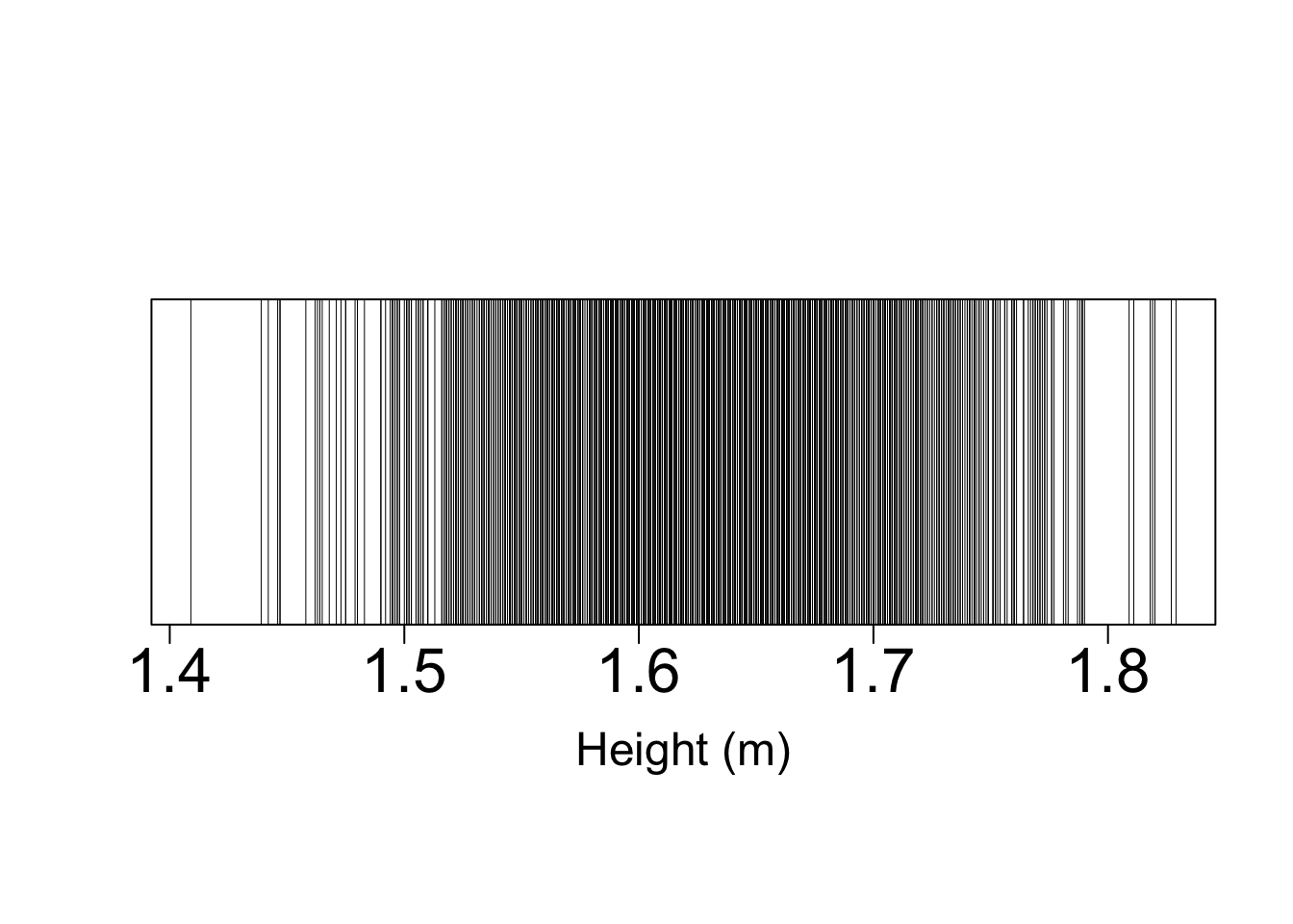
Above is a plot of the raw height data showing the distribution of the data. Each vertical line represents a data point. The data are not uniformly spread out across the entire range. There is a greaterdensity of dataat values in the centre of the range.
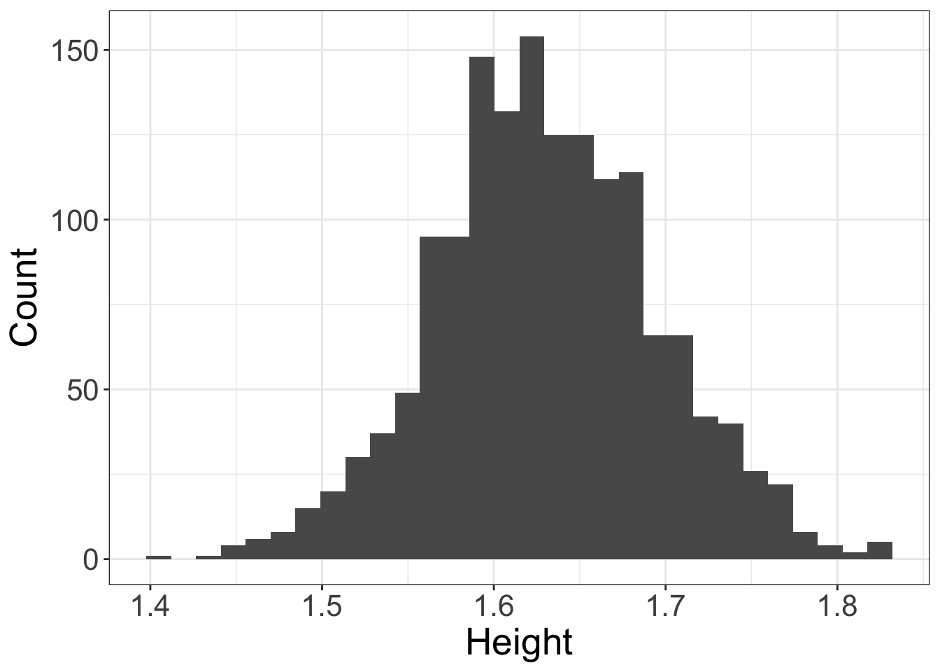
We can see the distribution of the data better using a histogram (R’shist()function orgeom_histogram()with the ggplot2 package). A histogram divides the range of heights into a number of bins and counts the number of data points in each bin.
Below is an example of a histogram with approximately 30 bins.
# Display a histogram of female heights from the HEIGHT.CSV dataset
ggplot(data=humanF,               # Define data to be plotted
       aes(x=HEIGHT)) +
  geom_histogram(bins=30) +       # Draw a histogram using 30 bins
  labs(x='Height',y='Count') +    # Set axis titles
  theme_bw() +                    # Set background to white
  theme(axis.title = element_text(size=20),  # Set fontsize of axis title
        axis.text =  element_text(size=16))  # Set fontsize of axis labels
Thedistributionof height is theprobabilityof observing an individual of heightx(wherexcan be any possible value).
Values with a high probability
We can see that heights in the centre of the range (around 1.63 m) have the highest probability of being observed.
Values with a low probability
From the histogram we can see that the probability of observing a height greater than 1.8 m is close to zero (there are 7 individuals out of 1552 with heights larger than 1.8 m).
Visualising a distribution
Graphical
Above we saw two graphical visualisations of distributions.
A distribution of a variable can be represented graphically, with a list of all the possible values of the variable on the x-axis and the relative frequency of observing each outcome (a number between 0 and 1) on the y-axis. Adding up the relative frequencies of all possible outcomes will always give a total of one, because it is 100% certain that some outcome is observed. The uncertainty is in which outcome.
The distribution of a continuous variable is sometimes called a(opens in a new window)probability density function(or PDF for short).
The distribution of a variable with a fixed number of outcomes (a qualitative variable, or a discrete quantitative variable) is sometimes called a(opens in a new window)probability mass function.
Theshape of a distributionis best visualised using a quantile-quantile plot (QQ-plot).
Online Lesson:Using QQ plots to visualise the shape of a distribution
This lesson is athttps://www.ucd.ie/ecomodel/Resources/QQplots_WebVersion.html
Numerical
We can start to describe any distribution by usingsummary statisticsthat describe some important aspects of the shape of a distribution.
Some common summary statistics are:
- central tendency(i.e. a value characteristic of the high probability region)
- spread(i.e. the ‘width’ of the high probability region)
- skew
Central tendency
Central tendency is a number that aims to describe where most outcomes occur
Three common measures of central tendency are:
- the arithmetic mean (R function
mean()) - the median (R function
median()) - the mode
Example: Themediancortisol level can be calculated as an estimate ofcentral tendency
# Calculate the median height, ignoring missing data
median(humanF$HEIGHT, na.rm=TRUE)
[1] 1.628Notice that the median corresponds to the region of high probability in the histogram of heights (above).
Spread
Spread is a number that aims to describe how variable the outcomes are around a central tendency
Three measures of spread are:
- the standard deviation (spread around the mean, R function
sd()) - the inter-quartile range (spread around the median, R function
IQR()) - the median absolute deviation (spread around the median, R function
mad())
Example: Themedian absolute deviation(MAD) can be calculated as an estimate ofspread around the median
# Calculate the median absolute deviation of
# height, ignoring missing data
mad(humanF$HEIGHT, na.rm=T)
[1] 0.0622692Poor numerical summaries
Themaxandmintend to be poor descriptors because they strongly depend upon the sample size. As the sample size increases you are more likely to observed extreme values (the maximum will increase and the minimum will decrease).For this reason the max and min are not robust descriptors of a distribution.
The maximum and minimum observed heights can be found using R’srange()function
# Calculate the range of the data, ignoring missing data
range(humanF$HEIGHT, na.rm=TRUE)
[1] 1.409 1.829A more robust measure of a distribution’s extremes are quantiles (say 1% and 99% quantiles)
# Calculate 1% and 99% quantiles, ignoring missing data
quantile(humanF$HEIGHT, prob=c(0.01, 0.99), na.rm=TRUE)
1% 99%
1.47704 1.77896 The Normal distribution
The normal distribution (sometimes called a Gaussian distribution) is an extremely important theoretical distribution in data analysis. The distribution is completely described by two parameters:
- the mean (commonly represented by µ)
- the standard deviation (commonly represented by σ)
These two parameters describe the bell shape of the normal distribution. The normal distribution is symmetric, meaning that the distribution can be reflected about the mean and look the same.
Generating random numbers
R can generate random numbers from a specified theoretical distribution. Here are three examples.
Normal distribution
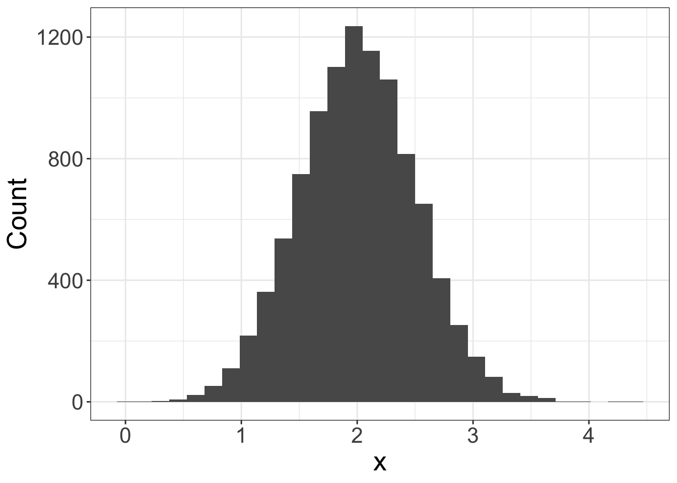
Use thernorm()function to generate random data drawn from a normal distribution (you can specify the two parameters of the normal distribution: the mean and standard deviation).
Below is the code to generate 10,000 values with mean=2 and standard deviation=0.5.
# .................................................
# Generate 10000 data point drawn from a normal distribution
# .................................................


normal_data = rnorm(n=10000, mean=2, sd=0.5)

# Produce a histogram of the generated data
ggplot(data=as.data.frame(normal_data),     # Define data to be plotted
       aes(x=normal_data)) +
  geom_histogram(bins=30) +                 # Draw a histogram using 30 bins
  labs(x='x',                               # Set axis titles
       y='Count') +
  theme_bw() +                              # Set background to white
  theme(axis.title = element_text(size=20), # Set fontsize of axis title
        axis.text =  element_text(size=16)) # Set fontsize of axis labels
Binomial distribution
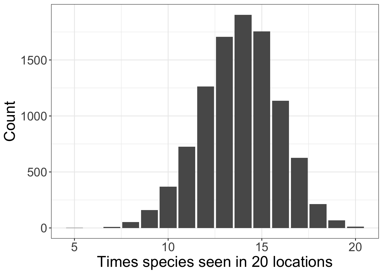
Use therbinom()function to generate the number of success given the number of attempts and the probability of a success.
The binomial distribution can be used to simulate the chance of seeing a species at a location given the probability that the species exists in the habitat.
Below is the code to generate the number of times a species is seen in a habitat out of 20 replicate habitats and a probability of occurence of 0.69 (69%). This is repeated 10,000 times and the distribution from these 10,000 draws from a binomial distribution plotted.
Categorical distribution
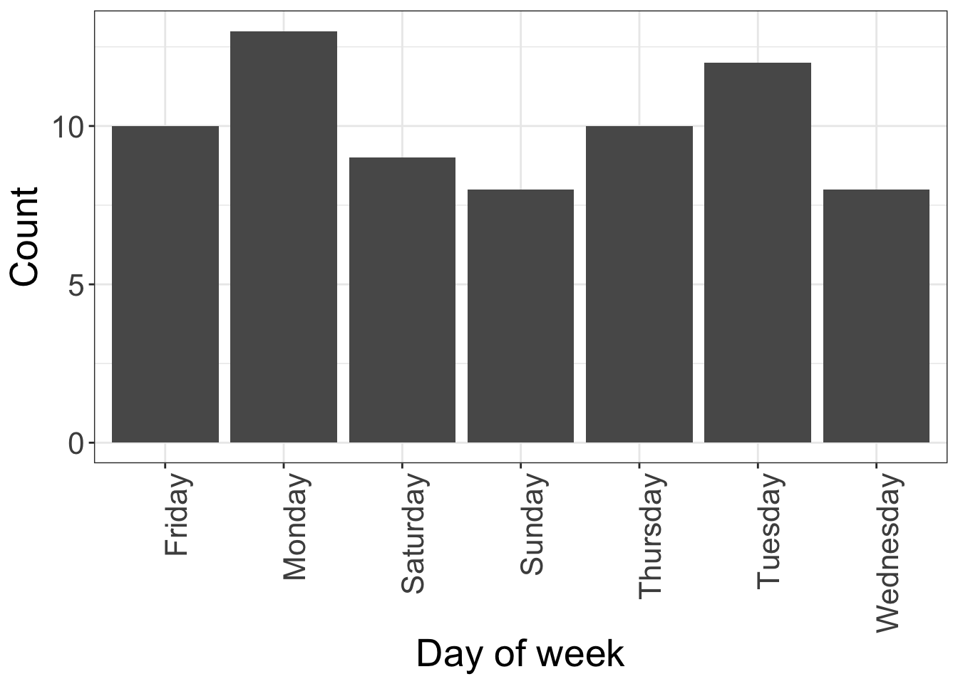
Use thesample()to randomly sample from a set of categorical outcomes.
# .................................................
# Generate categorical data
# .................................................

# Sample from a set of possible outcomes using sample()

# The outcomes are all the days of the week
week = c('Monday','Tuesday','Wednesday',
         'Thursday','Friday','Saturday','Sunday')

# Sample 1 day from the week
sample(week, size=1)
[1] "Thursday"We can repeat this sampling many times (70 times, say) using a for-loop
# Create a blank data frame
categorical_data = data.frame(day=rep(NA, times=70))

for (i in 1:70) {
  categorical_data$day[i] = sample(week, size=1)
}

# Produce a histogram of the generated data
ggplot(data=categorical_data,     # Define data to be plotted
       aes(x=day)) +
  geom_bar() +                              # Draw a barplot
  labs(x='Day of week',                     # Set axis titles
       y='Count') +
  theme_bw() +                              # Set background to white
  theme(axis.title = element_text(size=20), # Set fontsize of axis title
        axis.text =  element_text(size=16), # Set fontsize of axis labels
        axis.text.x = element_text(angle=90,# Rotate x axis labels
                                   hjust=1))# Justify text
Using a theoretical distribution
A theoretical distribution is used in data analysis to:
- provide a mathematical description of a random variable
- provide a distribution which canmimic observations
- provides a link between statistical theory and observed data
A Normal distribution is a theoretical distribution. A Normal distribution with mean = 1.63 m and standard deviation = 0.064 produces datasimilarto our observations of female heights (humanF$HEIGHT)
Below we have graphed histograms of the 1552 real human height observations (left) and a random sample of 1552 values drawn from a Normal distribution (right). On top of these two histograms the Normal distribution is represented as the red line (with mean = 1.63 m and standard deviation = 0.064 m).
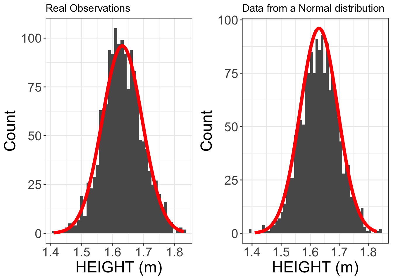
The data produced by this Normal distribution is very similar to the real height observations. This will allow us to use a Normal distribution (with mean = 1.63 m and standard deviation = 0.064 m) as a mathematical basis for an analysis of these height data.
Summary of topics
- A distribution describes all possible outcomes and their relative frequencies
- A measure of central tendency (e.g. median, mean) and a measure of spread (e.g. median absolute deviation, standard deviation) are descriptive statistics that start to describe a distribution
- A histogram and quantile-quantile plot can be used to visualise a distribution
- The normal distribution is the single most important theoretical distribution in data analysis
- The normal distribution is completely described by two parameters: mean and standard deviation
- A common departure from normally distributed data is right-skew.
- Normal data can be generate in R using the
rnorm()function - Categorical data can be generated using the
sample()function
Further Reading
All these books can be found in UCD’s library
- Mark Gardner, 2012Statistics for Ecologists Using R and Excel(Pelagic, Exeter) [Chapter 4]
- Tenko Raykov and George A Marcoulides, 2013Basic statistics: an introduction with R(Rowman and Littlefield, Plymouth)
- John Verzani, 2005Using R for introductory statistics(Chapman and Hall, London)
