Quantile-Quantile Plots
Some example QQ plots
Introduction
To help you identify different types of distributions from a quantile-quantile plot, we give examples of histograms and quantile-quantile plots for five qualitatively different distributions:
- A normal distribution
- A right-skewed distribution
- A left-skewed distribution
- An under-dispersed distribution
- An over-dispersed distribution
Normally distributed data
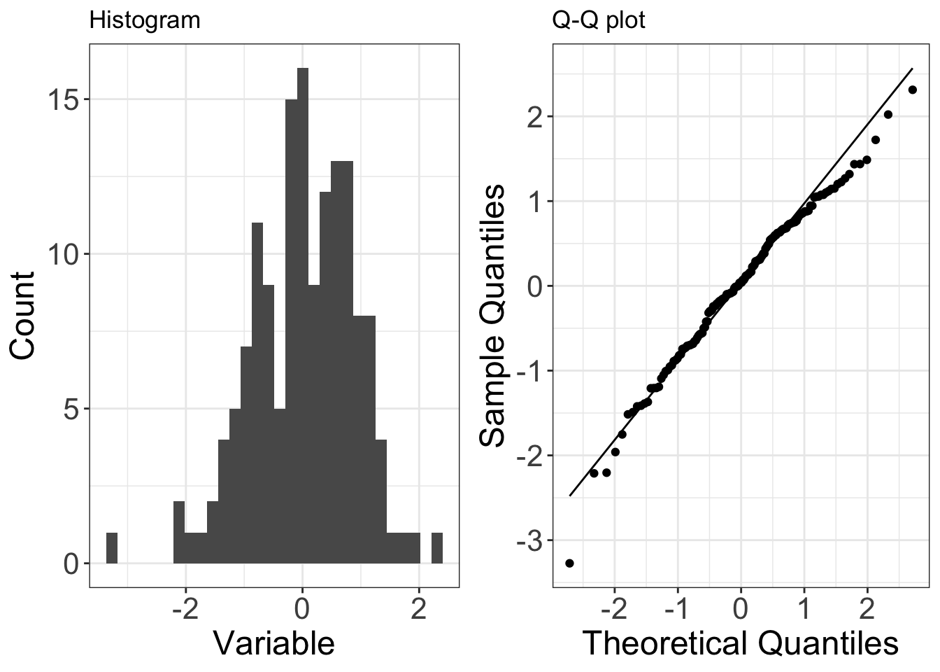
Below is an example of data (150 observations) that are drawn from a normal distribution. The normal distribution issymmetric, so it has no skew (the mean is equal to the median).
On a Q-Q plot normally distributed data appears as roughly a straight line (although the ends of the Q-Q plot often start to deviate from the straight line).
Right-skewed data
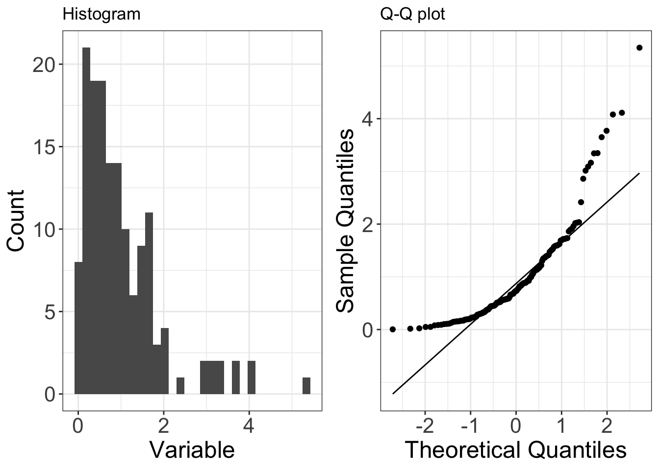
Below is an example of data (150 observations) that are drawn from a distribution that isright-skewed(in this case it is the exponential distribution). Right-skew is also known aspositive skew.
On a Q-Q plot right-skewed data appears as a concave curve.
You can start to understand this pattern by considering the smallest and largest observations (left-hand and right-hand sides of the QQ-plot, respectively):
- the smallest observations are larger than you would expect from a normal distribution (i.e. the points are above the line on the QQ-plot). This means the lower tail of the data’s distribution has beenreduced, relative to a normal distribution.
- the largest observations are larger than you would expect from a normal distribution (i.e. the points are above the line on the QQ-plot). This means the upper tail of the data’s distribution has beenextended, relative to a normal distribution.
Left-skewed data
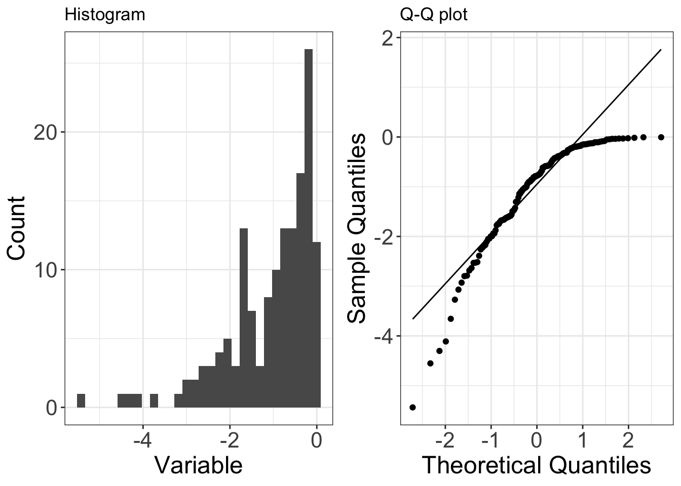
Below is an example of data (150 observations) that are drawn from a distribution that isleft-skewed(in this case it is a negative exponential distribution). Left-skew is also known asnegative skew.
On a Q-Q plot left-skewed data appears as a concave curve (the opposite of right-skewed data).
You can start to understand this pattern by considering the smallest and largest observations (left-hand and right-hand sides of the QQ-plot, respectively):
- the smallest observations are smaller than you would expect from a normal distribution (i.e. the points are below the line on the QQ-plot). This means the lower tail of the data’s distribution has beenextended, relative to a normal distribution.
- the largest observations are smaller than you would expect from a normal distribution (i.e. the points are below the line on the QQ-plot). This means the upper tail of the data’s distribution has beenreduced, relative to a normal distribution.
Under-dispersed data
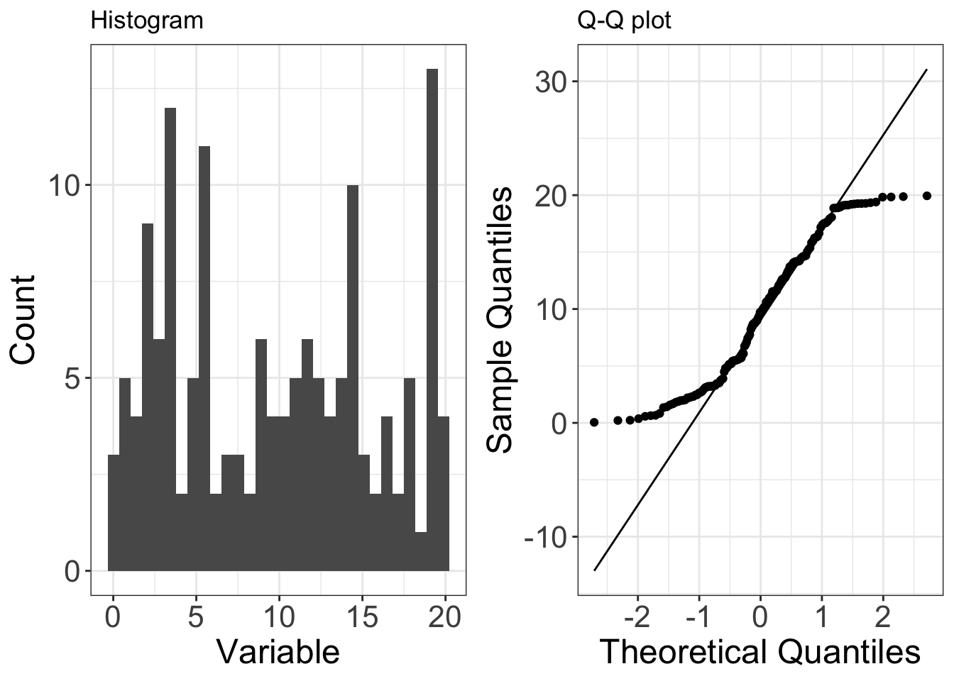
Below is an example of data (150 observations) that are drawn from a distribution that isunder-dispersedrelative to a normal distribution (in this case it is the uniform distribution). Under-dispersed data has a reduced number of outliers (i.e. the distribution has thinner tails than a normal distribution). Under-dispersed data is also known as having aplatykurtic distributionand as havingnegative excess kurtosis.
On a Q-Q plot under-dispersed data appears S shaped.
You can start to understand this pattern by considering the smallest and largest observations (left-hand and right-hand sides of the QQ-plot, respectively):
- the smallest observations are larger than you would expect from a normal distribution (i.e. the points are above the line on the QQ-plot). This means the lower tail of the data’s distribution has beenreduced, relative to a normal distribution.
- the largest observations are less than you would expect from a normal distribution (i.e. the points are below the line on the QQ-plot). This means the upper tail of the data’s distribution has beenreduced, relative to a normal distribution.

Over-dispersed data
Below is an example of data (150 observations) that are drawn from a distribution that isover-dispersedrelative to a normal distribution (in this case it is a Laplace distribution). Over-dispersed data has an increased number of outliers (i.e. the distribution has fatter tails than a normal distribution). Over-dispersed data is also known as having aleptokurtic distributionand as havingpositive excess kurtosis.
On a Q-Q plot over-dispersed data appears as a flipped S shape (the opposite of under-dispersed data).
You can start to understand this pattern by considering the smallest and largest observations (left-hand and right-hand sides of the QQ-plot, respectively):
- the smallest observations are smaller than you would expect from a normal distribution (i.e. the points are below the line on the QQ-plot). This means the lower tail of the data’s distribution has beenextended, relative to a normal distribution.
- the largest observations are larger than you would expect from a normal distribution (i.e. the points are above the line on the QQ-plot). This means the upper tail of the data’s distribution has beenextended, relative to a normal distribution.
