# This is a chunk of R code. All text after a # symbol is a comment
# Set working directory using setwd() function
setwd('Enter the path to my working directory')

# Clear all variables in R's memory
rm(list=ls()) # Standard code to clear R's memoryContents
- Objectives
- Introduction
- Before you continue:
- Descriptive statistics
- Qualitative data
- Quantitative data
- Quantitative data continued
- Styling a ggplot
- Making figures accessible to all
- Saving a plot as an image file
- More visualisation ideas
- Summary of the topics covered
- Further Reading
- Appendix: codes for plotting symbols
Exploratory Data Analysis
A tutorial about data analysis using R (Website Version)
How to Read this Tutorial
This tutorial is a mixture of R code chunks and explanations of the code. The R code chunks will appear in boxes.
Below is an example of a chunk of R code:
Sometimes the output from running this R code will be displayed after the chunk of code.
Here is a chunk of code followed by the R output
2 + 4 # Use R to add two numbers[1] 6Objectives
The objectives of this tutorial are to use R for:
- Numerical data summaries of
- central tendency
- spread
- correlation
- Visualise qualitative data using
- contingency tables
- graphs
- Visualise quantitative data using
- graphs
- Save graphical output to a file
Introduction
Exploratory data analysis is the first step in any data analysis. It involves visualising your data using graphical and numerical summaries.
Exploratory data analysis is not technical. You can use your own creativity to explore your data in order to:
- Gain a better understanding of the patterns in the data before you start a formal analysis
- Spot any errors in the data, and correct them, before you start an analysis
This tutorial will look at the visualisation functions in theggplot2package and some of R’s basic data visualisation functions.
Before you continue:
Review this online lesson about data types.
This lesson is athttps://www.ucd.ie/ecomodel/OnlineLessons/lesson1_datatypes_Website.html
Overview of the data
We will primarily be using two data sets:msleep,WOLF.CSV. Some examples will also use the datasetMALIN_HEAD.TXT. These data are described athttp://www.ucd.ie/ecomodel/Resources/datasets.html
The wolf data set was used in the“Importing data into R”tutorial and the msleep data set was used in the“Getting started with R”worksheet.
Import data
Start by loading the two data sets. See the data import tutorial for more details on this.
# Import data ------------------

# Load the 'ggplot2' package (required to access msleep dataset)
library('ggplot2')

wolf = read.table('WOLF.CSV', header=T, sep=',') # Import wolf data set
data(msleep) # Load msleep data setALWAYScheck that the data have been imported correctly. For this you can use functions such as:
ls(),head(),tail()and `summary()
Once the data are imported we create a subset of the data that only contains data from populations 1 and 2. We also create a new qualitative variable (factor) that codes for hunting intensity in the different populations (light hunting intensity in population 1, heavy hunting intensity in population 2).
# Subset the wolf data frame and remove unwanted levels
wolf.sub = droplevels(subset(wolf, Population!=3))


# Create a new variable called Hunting
wolf.sub$Hunting = 'Heavy'
wolf.sub$Hunting[wolf.sub$Population==1] = 'Light'

# Make the variable Hunting a factor
wolf.sub$Hunting = as.factor(wolf.sub$Hunting)
Descriptive statistics
A descriptive statistic summarizes a set of observations with a single number. Examples of descriptive statistics are estimates ofcentral tendency(e.g. mean, median, mode),spread(e.g. standard deviation, inter-quartile range) andextremes(e.g. max and min values).
Central tendency
(opens in a new window)Central tendencydescribes the middle of the data, where most observations lie.
Two measures of central tendency are the mean and the median.
# Measures of central tendency for all cortisol concentrations
# The argument na.rm=TRUE removes any missing values (NA's)
mean(wolf.sub$Cpgmg, na.rm=TRUE)               # Mean
median(wolf.sub$Cpgmg, na.rm=TRUE)             # Median
quantile(wolf.sub$Cpgmg, prob=0.5, na.rm=TRUE) # Median = 50% quantile
The mean is commonly used, but it is overly influenced by extreme outliers
Example: Does the mean of the numbers 1.1, 1.2, 1.3, 1.4, 1.5, 1.6, 1.7, 1.8, 1.9, 1000 reflect the ‘middle’ of the data?
The median is amore robustestimator of central tendency that is less affected by extreme outliers (e.g. repeat the above example using the median instead of the mean).
Spread
(opens in a new window)Spreaddescribes how far the data are scattered around the central tendency.
Three measures of spread are the standard deviation, the inter-quartile range (IQR) and the median absolute deviation (MAD).
# Measures of spread for all cortisol concentrations
sd(wolf.sub$Cpgmg, na.rm=T)                  # (Sample) Standard deviation
IQR(wolf.sub$Cpgmg, na.rm=T)                 # Inter-quartile range
mad(wolf.sub$Cpgmg, na.rm=T)                 # Median absolute deviation
The standard deviation quantifies spread about the mean. Like the mean it is influenced by outliers. The square of the standard deviation is called the variance.
Both the inter-quartile range and the median absolute deviation quantify spread about the median. Both are more robust to outliers than the standard deviation.
The inter-quartile range is defined as the difference between the 25% and 75% quantiles.
summary()of a data frame
Applying thesummary()function to a data frame will automatically gives many of these descriptive statistics.
# Summarise the wolf.sub data frame
summary(wolf.sub)
Individual Sex Population Colour
Min. : 1.00 Length:148 Min. :1.000 Length:148
1st Qu.: 37.75 Class :character 1st Qu.:1.000 Class :character
Median : 74.50 Mode :character Median :2.000 Mode :character
Mean : 74.50 Mean :1.696
3rd Qu.:111.25 3rd Qu.:2.000
Max. :148.00 Max. :2.000
Cpgmg Tpgmg Ppgmg Hunting
Min. : 4.75 Min. : 3.250 Min. :12.76 Heavy:103
1st Qu.:12.16 1st Qu.: 4.378 1st Qu.:19.50 Light: 45
Median :15.38 Median : 5.030 Median :25.00
Mean :16.61 Mean : 5.617 Mean :25.89
3rd Qu.:19.98 3rd Qu.: 6.067 3rd Qu.:30.01
Max. :40.43 Max. :15.130 Max. :53.28
NA's :79 Note: the 1st and 3rd quartiles (1st Qu. and 3rd Qu.) are the 25% and 75% quantiles respectively. The 2nd quartile is the median (50% quantile).
Other descriptive statistics
Some functions for other descriptive statistic:
# Other descriptive statistics
quantile(wolf.sub$Cpgmg, prob=0.25, na.rm=T) # Quantiles (here 25% quantile)
max(wolf.sub$Cpgmg, na.rm=T)                 # Maximum
min(wolf.sub$Cpgmg, na.rm=T)                 # Minimum
range(wolf.sub$Cpgmg, na.rm=T) # Range = Maximum - MinimumThemomentspackage must be loaded for descriptive statistics of skewness and kurtosis.
library(moments)                            # Load the moments package

skewness(wolf.sub$Cpgmg, na.rm=T) # Skewness of cortisol dataNote: In the tutorial on distributions we’ll see that skew is the asymmetry of a distribution about its mean
Correlation
Acorrelationis a relationship betweentwo variables. The strength of a relationship can be quantified using a correlation coefficient (we will look at this in more detail in the tutorial on regression).
Two common correlation coefficients arePearson correlation coefficientandSpearman’s rank correlation coefficient.
Here is an example of calculating correlation coefficients between variablesCpgmgandPpgmgin thewolf.subdata frame.
# Calculate Pearson's correlation coefficient
cor(wolf.sub$Cpgmg, wolf.sub$Ppgmg, use='complete.obs', method='pearson')

# Calculate Spearman's rank correlation coefficient
cor(wolf.sub$Cpgmg, wolf.sub$Ppgmg, use='complete.obs', method='spearman')
Both these coefficients can take values between -1 and 1.
- Correlations close to -1 are very strong negative relationships
- Correlations close to 0 are weak relationships
- Correlations close to 1 are very strong positive relationships
Qualitative data
Contingency Tables
Qualitative variables can be described by contingency tables. Given a qualitative variable (e.g. types of mammals: herbivore, omnivore, …) a contingency table records how many observations there are in each category. A contingency table can easily display up to two qualitative variables. Higher numbers of variables quickly become difficult to represent (e.g. three qualitative variables would require the equivalent of a three dimensional table).
The functiontable()can be used to create contingency tables. Below are examples with the msleep data frame
# A one dimensional contingency table
# The distribution of observations across mammalian foraging types
table(msleep$vore)
  carni   herbi insecti    omni
     19      32       5      20
A two dimensional contingency table showing the number of species from each feeding type in each category of conservation status (cd=critically endangered, en=endangered, lc=least concern, nt=near threatened, vu=vulnerable).
# A two dimensional contingency table
table(msleep$conservation, msleep$vore)
               carni herbi insecti omni
  cd               1     1       0    0
  domesticated     2     7       0    1
  en               1     2       1    0
  lc               5    10       2    8
  nt               1     3       0    0
  vu               4     3       0    0
Barplots
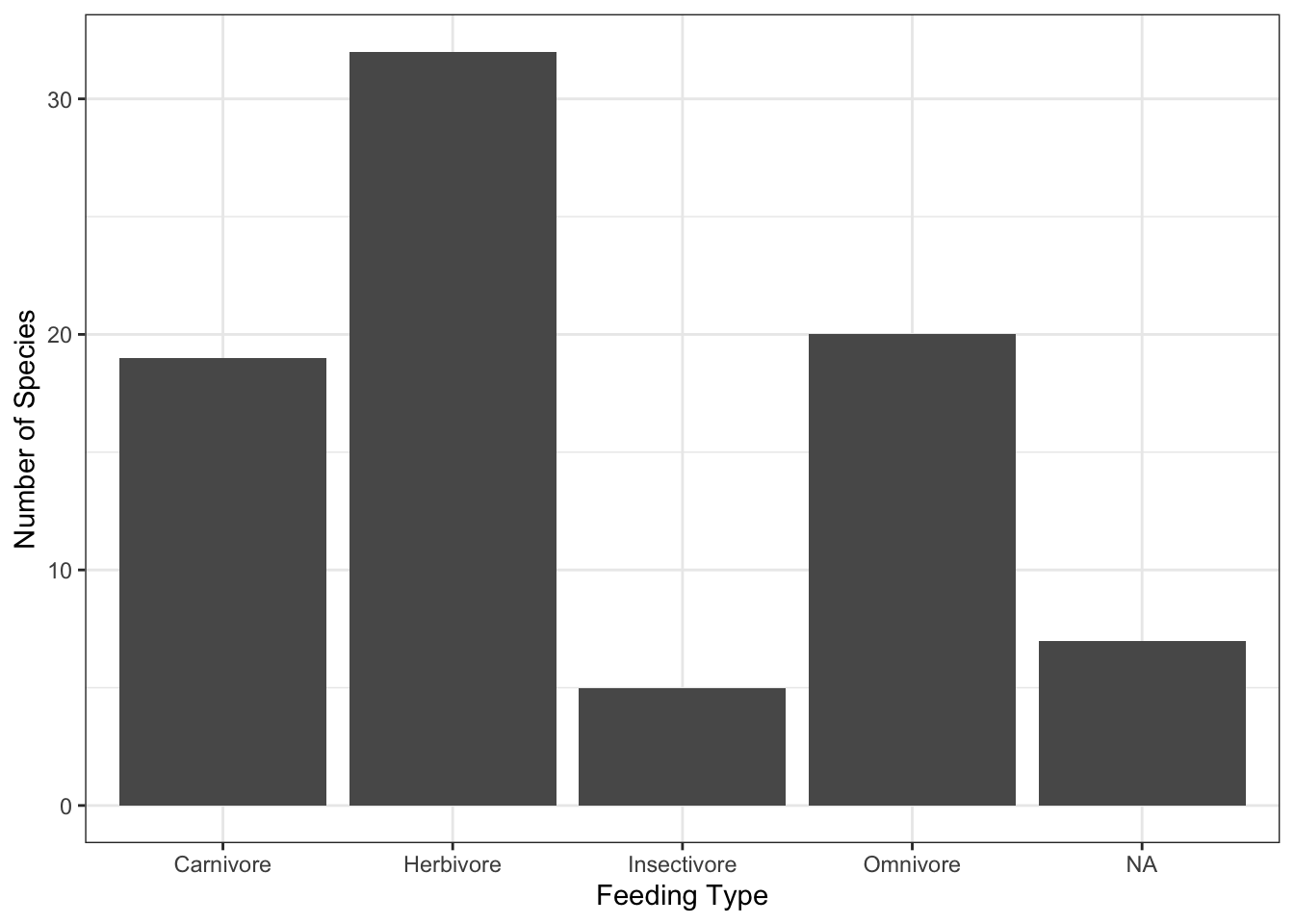
A barplot is a one way to displaying how data are distributed across aqualitative variable. Each bar represents one category of the variable and the height of each bar usually represents the number of data points in each category.
A barplot is a graphical representation of a contingency table.
Below we use the packageggplot2to produce a bar plot of the feeding types of species in themsleepdata.
(opens in a new window)Video Tutorial:The anatomy of a ggplot command (3 mins)
library(ggplot2)      # Load ggplot2 graphics library

# Define labels for the bars
labs = c('herbi'='Herbivore',
         'carni'='Carnivore',
         'omni'='Omnivore',
         'insecti'='Insectivore')

# Use ggplot2 to produce a ...
# Bar plot of the distribution of feeding types in the msleep data set
ggplot(data=msleep,                   # Define the data to plot
       aes(x=vore)) +
  geom_bar() +                        # Draw a bar plot
  scale_x_discrete(labels=labs) +     # Set x-axis labels
  labs(x='Feeding Type',              # Set axis titles
       y='Number of Species') +
  theme_bw()                          # Set background to white
Notice that we have relabeled the bars with more meaningful names. Graphical output should be styled so that it is easy to read.
We will see how the font size of the text can be increased later. For now we will tweak the plot to use different colours to fill the bars.
# Bar plot of the distribution of feeding types in the msleep data set
# with different colours for the different bars
ggplot(data=msleep,                             # Define the data to plot
       aes(x=vore,
           fill=vore)) +                        # Define how bars are coloured
  geom_bar() +
  scale_x_discrete(name = 'Feeding Type',
                   labels=labs) +
  scale_fill_discrete(name = 'Feeding Type',    # Define the legend's title and labels
                      labels=labs) +
  labs(x='Feeding Type',
       y='Number of Species') +
theme_bw() 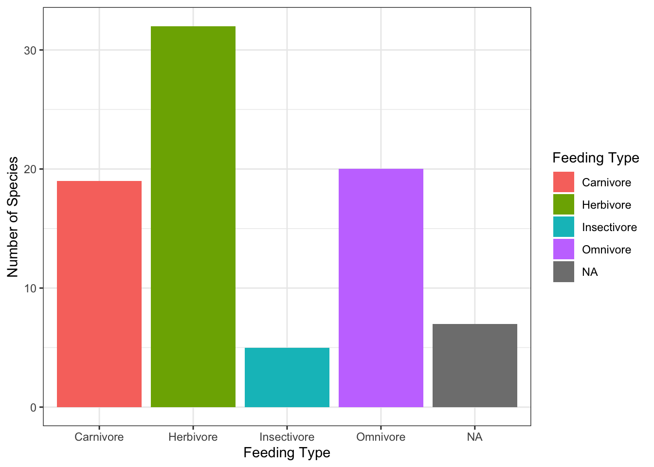
ggplot2 help pagesare available at(opens in a new window)https://ggplot2.tidyverse.org
R’s basic plotting commands also has thebarplot()function to produce barplots. Try running the command below.
# R's base function for producing a barplot

# Bar plot of the distribution of feeding types in the msleep data set
barplot(table(msleep$vore),
        names.arg=c('Carnivore','Herbivore','Insectivore','Omnivore'),
        col='darkgrey',
        xlab='Feeding Type',ylab='Number of Species')
Pie charts
Pie charts are sometimes used for displaying how a whole quantity is divided into proportions. They are another way of representing the data’s distribution across a qualitative variable. Each section of a pie chart is one category of the qualitative variable and the size of the section represents the proportion of data points out of the entire data set that have that value.
Displaying the above barplot as a pie chart using R’spie()function gives,
# Display a pie chart

# Plot the proportions of foraging types in the msleep dataset
pie(table(msleep$vore))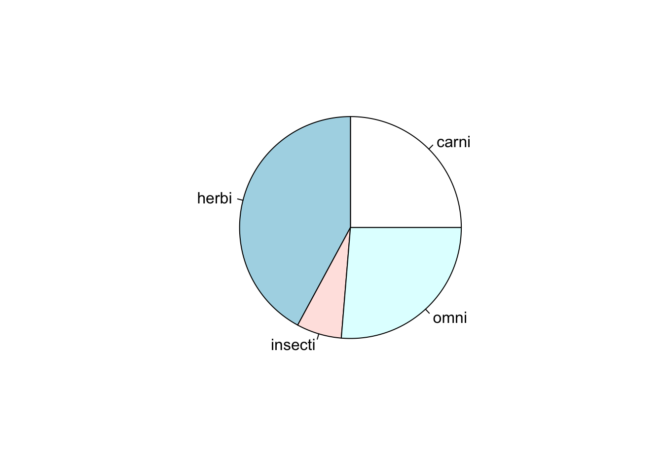
One disadvantage of this chart is that it does not communicate the number of data points used to calculate the proportions.
Quantitative data
Histograms
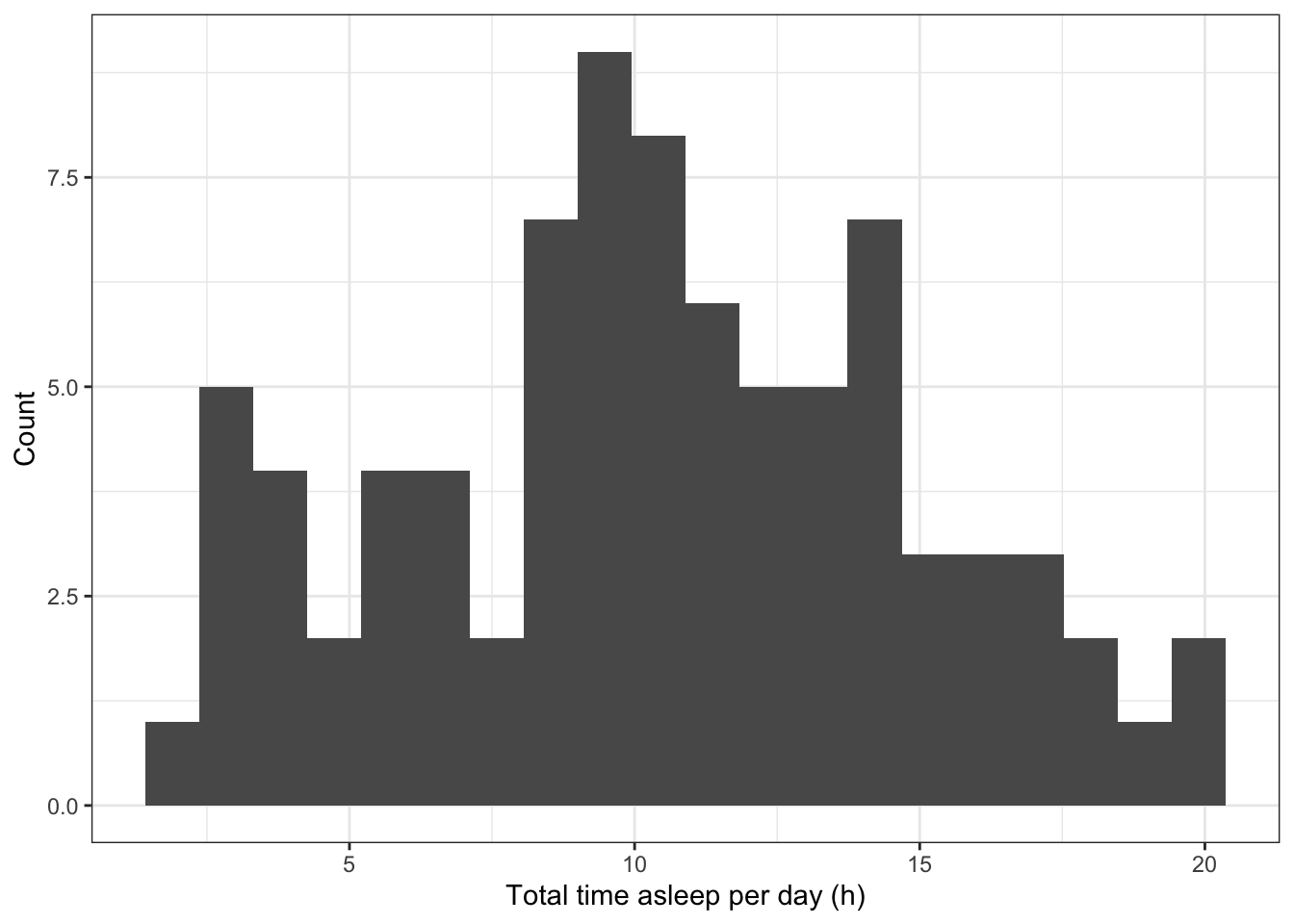
The distribution of data across aquantitative datacan be visualised using ahistogram.
Below the distribution of the daily time spent asleep for the mammals (from themsleepdata set) is visualised using a histogram with approximately 20 bins
# Histogram of the number of hours per day mammals are asleep
# (using 20 bins along the x axis)
ggplot(data=msleep,                        # Define the data to plot
       aes(x=sleep_total)) +
  geom_histogram(bins=20) +                # Draw the histogram with 20 bins
  labs(x='Total time asleep per day (h)',  # Set axis titles
       y='Count') +
  theme_bw()                               # Set the background to white
R can also produce histograms withoutggplot2using thehist()command.
# R's base function for a histogram

# Histogram of the number of hours per day mammals are asleep
hist(msleep$sleep_total, breaks=20)
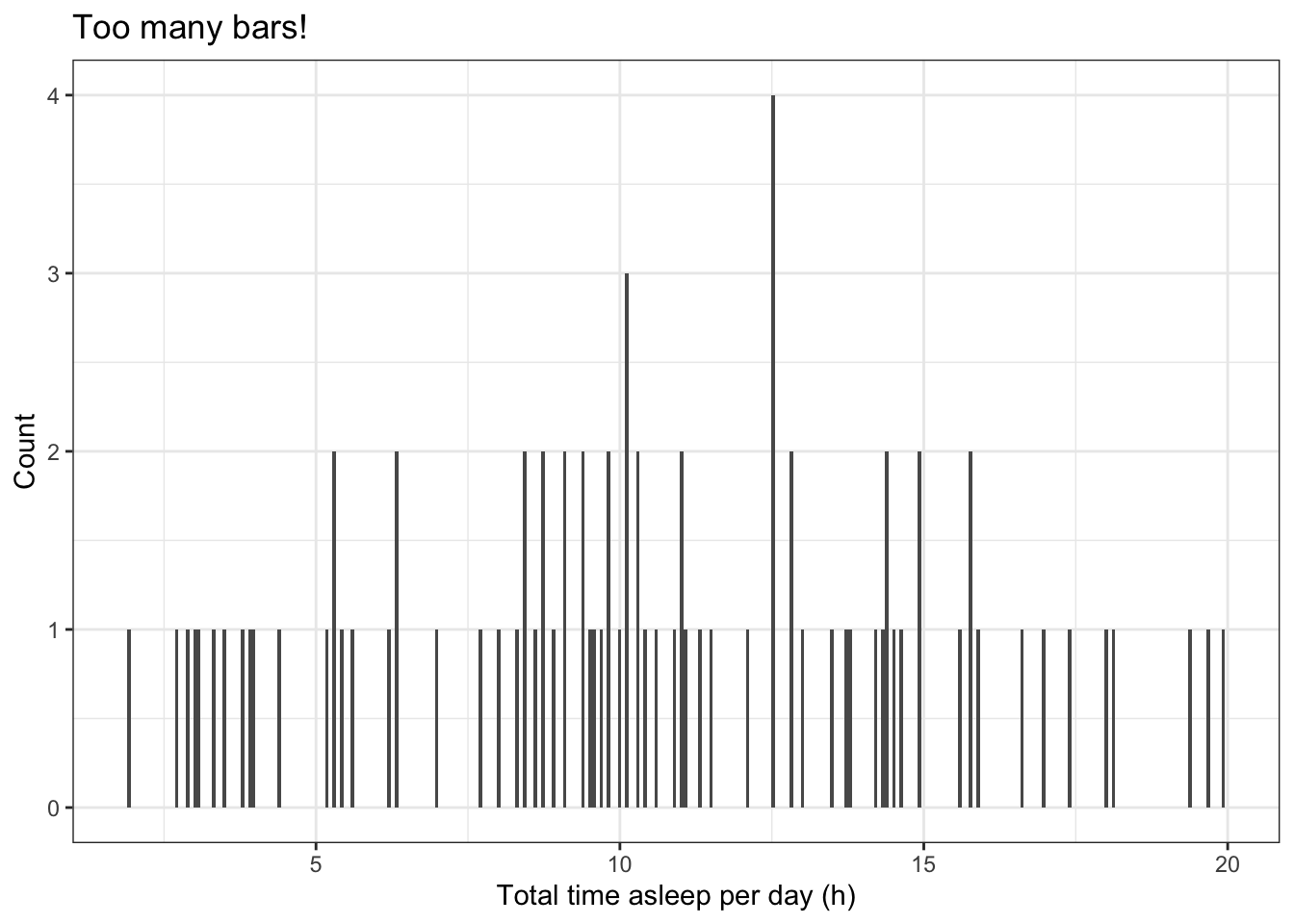
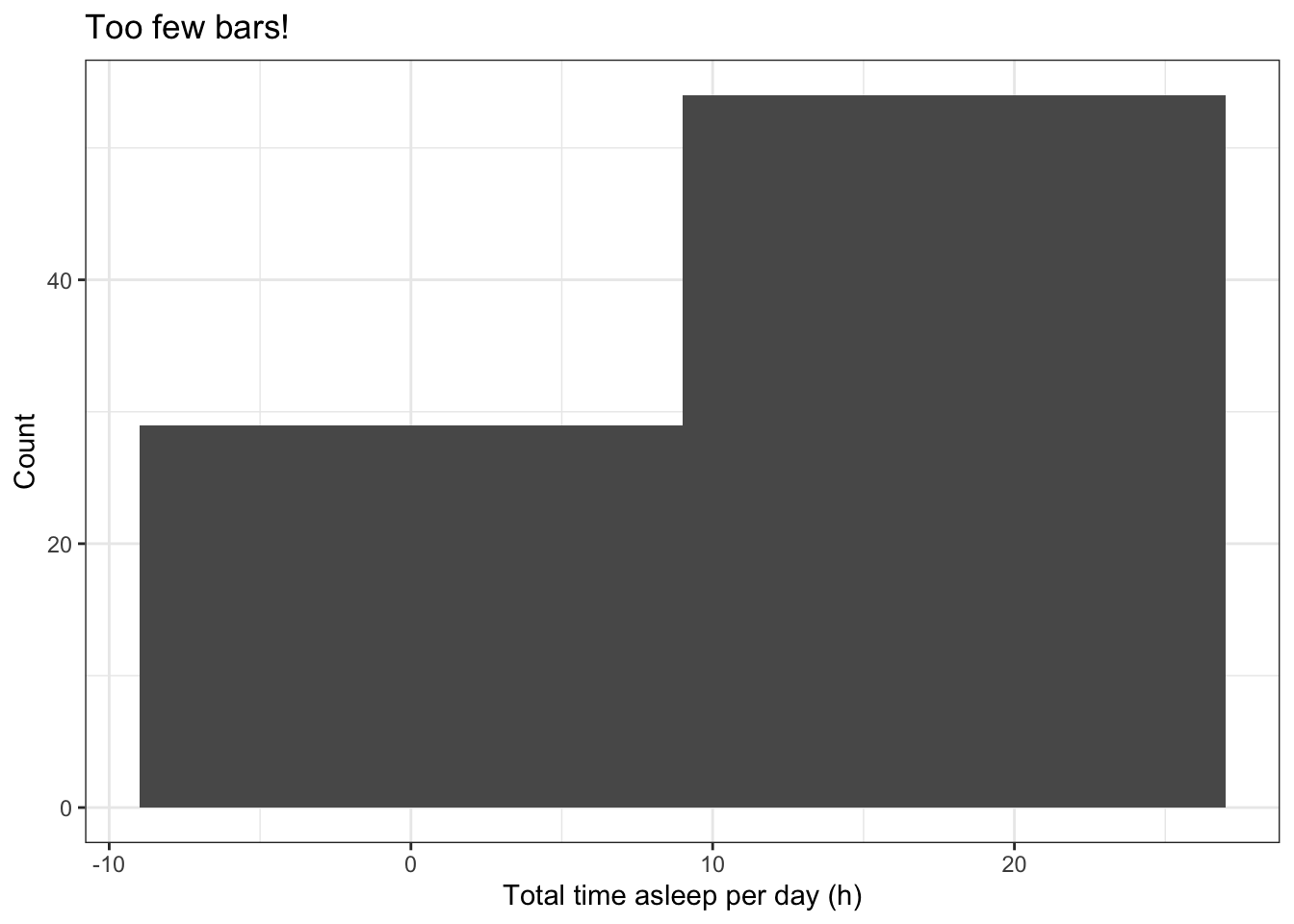
The number of bars used to represent the distribution can affect our interpretation. Too many bars or too few bars can both make the visualisation meaningless.
# A histogram with too many bars
ggplot(data=msleep,                        # Define the data to plot
       aes(x=sleep_total)) +
  geom_histogram(bins=300) +               # Draw the histogram with 300 bins
  labs(x='Total time asleep per day (h)',  # Set axis labels
       y='Count',title='Too many bars!') +
  theme_bw()                               # Set the background to white
# A histogram with too few bars ggplot(data=msleep, # Define the data to plot aes(x=sleep_total)) + geom_histogram(bins=2) + # Draw the histogram with 2 bins labs(x='Total time asleep per day (h)', # Set axis titles y='Count',title='Too few bars!') + theme_bw() # Set the background to white
Kernel density plotsare another way to visualise the distribution of a continuous quantitative variable (see the R functiondensity()), but we will not describes these in this tutorial.
Q-Q plots
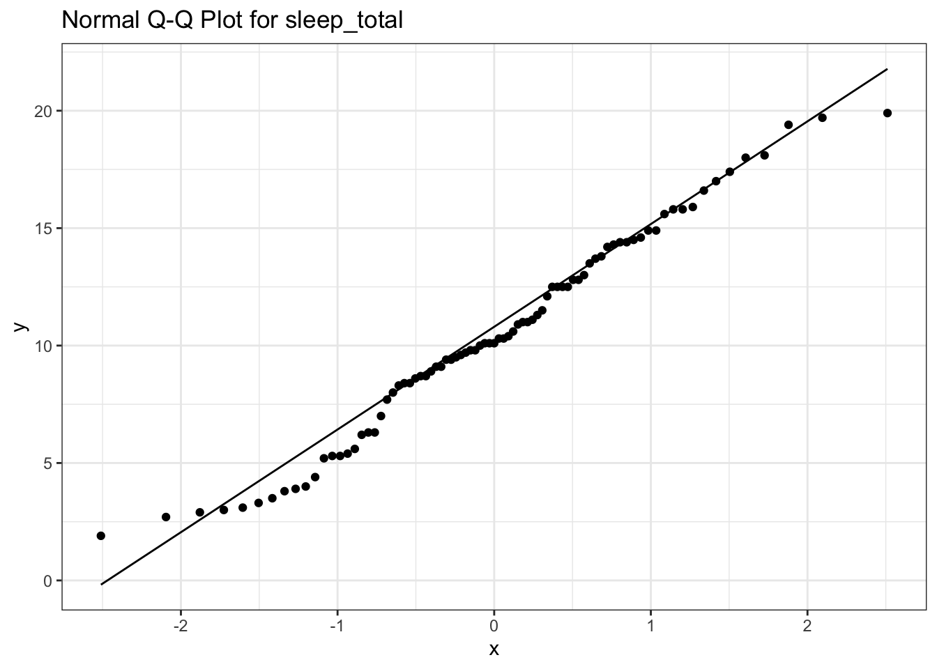
Quantile-quantile plots (Q-Q plots) are a good way to compare the distribution of your data to a normal distribution (other distributions can also be used). Quantile-quantile plots are often used to test the assumptions of a data analysis (many common analysis methods assume theresidualsfrom an analysis will be close to a normal distribution).
ggplot’sgeom_qq()can be used to produce a quantile-quantile plot (R’s base function isqqnorm()). The points will lie on a straight line if data are close to being normal.geom_qq_line()can be used to add a line onto theggplot2plot.
Here is an example that produces a Q-Q plot (quantile-quantile plot) of the variablesleep_totalin themsleepdata set.
# A quantile-quantile plot for variable sleep_total in the msleep data set
# Add a title that reminds us which variable is being plotted
ggplot(data=msleep,                                # Define the data to plot
       aes(sample=sleep_total)) +
  geom_qq() +                                      # Draw the QQ plot points
  geom_qq_line() +                                 # Draw the QQ plot line
  labs(title='Normal Q-Q Plot for sleep_total') +  # Add a title
  theme_bw()                               # Set the background to white
The points lie along a fairly good straight line indicating that the distribution of total sleep across the mammal species inmsleepdata set is approximately normal.
Q-Q plots can also be produced without ggplot2. Try the following example:
# R's base functions for Q-Q plots

# A quantile-quantile plot for variable sleep_total in the msleep data set
# Add a title that reminds us which variable is being plotted
qqnorm(msleep$sleep_total, main='Normal Q-Q Plot for sleep_total')

# Add a straight line to this plot to help its interpretation
qqline(msleep$sleep_total)
An example of a non-normal distribution
The distribution of mammal REM sleep times (variablemsleep$sleep_rem) is not normally distributed. This variable is right-skewed (see the tutorial on data distributions for more details on skewed distributions).
# A quantile-quantile plot for variable sleep_rem in the msleep data set
# Add a title that reminds us which variable is being plotted
ggplot(data=msleep,                             # Define the data to plot
       aes(sample=sleep_rem)) +
  geom_qq(na.rm=TRUE) +                         # Draw the QQ plot points
  geom_qq_line(na.rm=TRUE) +                    # Draw the QQ plot line
  labs(title='Normal Q-Q Plot for sleep_rem') + # Add a title
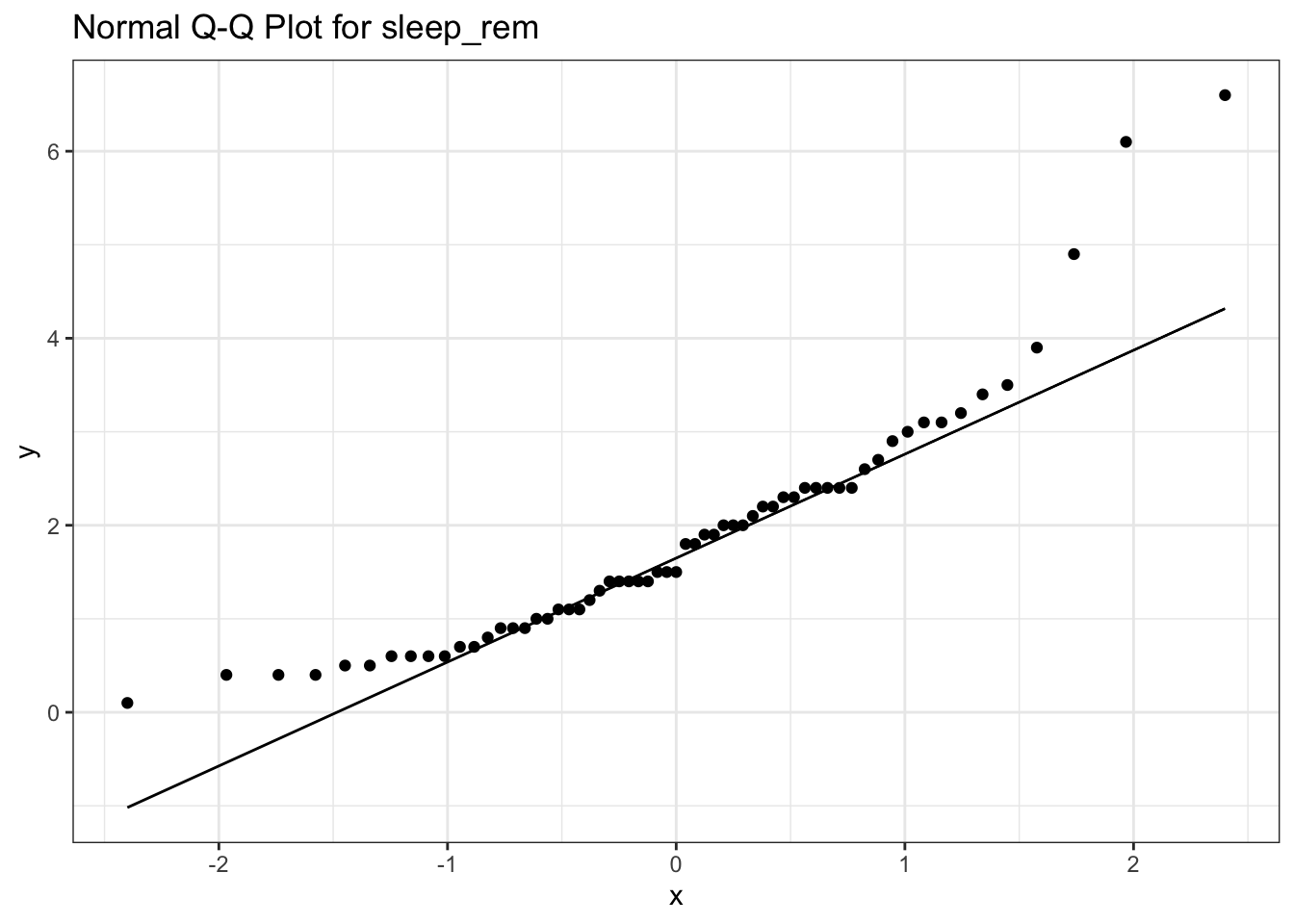
The Q-Q plot shows that the points do not lie on a straight line, and so the variable is not well described by a normal distribution.
Box and whisker plots
A broad indication of a quantitative variable’s distribution can be seen by plotting quantiles (e.g. 0%, 25%, 50%, 75% and 100% quantiles correspond to minimum, 1st quartile, median, 3rd quartile and the maximum). Quantiles can be calculated using thequantile()function.
# Plot the 0%, 5%, 25%, 50%, 75%, 95% and 100% quantiles
# for the Cpgmg variable in the wolf data frame
quantile(wolf.sub$Cpgmg, probs=c(0, 0.05, 0.25, 0.5, 0.75, 0.95, 1.0) )
0% 5% 25% 50% 75% 95% 100%
4.7500 8.8645 12.1600 15.3750 19.9750 27.6380 40.4300 Quantiles are commonly represented on abox and whiskers plot. This can be produced inggplot2usinggeom_boxlot()
# Box and whiskers plot for the Cpgmg variable in the wolf data frame
ggplot(data=wolf.sub,                      # Define the data to plot
       aes(x=NULL,
           y=Cpgmg)) +
  geom_boxplot() +                         # Draw a box and whiskers plot
  labs(y='Cortisol [pg/mg]') +             # Add y-axis title
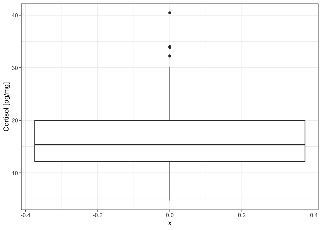
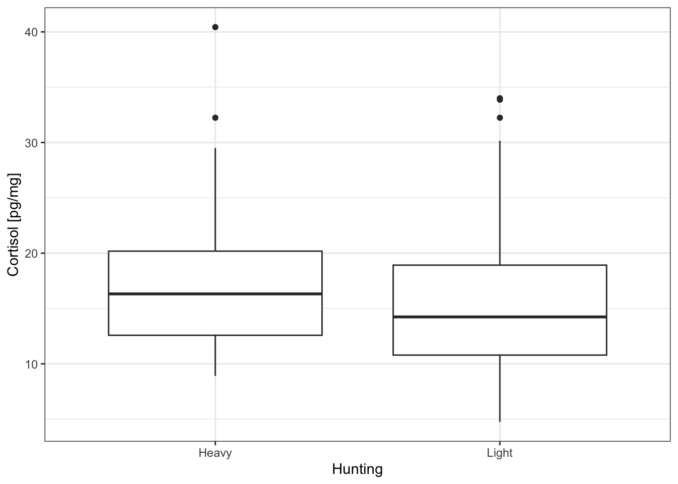
The box and whiskers plot displays:
- the median as the central bar in the box
- the 25% quantile as the lower end of the box
- the 75% quantile as the upper end of the box
- outliers as individual points
- whiskers extend to 1.5 times the inter-quartile range
Box and whisker plots show less information than a histogram but they can be used to easily plot the distributions from several variables. For example, we can compare the distributions from the two populations in thewolf.subdata frame (one population associated with heavy hunting pressure, the other with light hunting pressure).
# Box and whiskers plot for the Cpgmg variable from
# populations with light and heavy hunting
ggplot(data=wolf.sub,                      # Define the data to plot
       aes(x=Hunting,
           y=Cpgmg)) +
  geom_boxplot() +                         # Draw a box and whiskers plot
  labs(y='Cortisol [pg/mg]') +             # Add y-axis title
  theme_bw()                               # Set the background to white
theme_bw() # Set the background to white theme_bw() # Set the background to whiteDraw a box and whiskers plot across two variables (Hunting and Sex)
# Box and whiskers plot for the Cpgmg variable from
# populations with light and heavy hunting
# and colours representing the sex
ggplot(data=wolf.sub,                      # Define the data to plot
       aes(x=Hunting,
           y=Cpgmg,
           fill=Sex)) +                    # Different fill colours
  geom_boxplot() +                         # Draw a box and whiskers plot
  labs(y='Cortisol [pg/mg]') +             # Add y-axis title
  theme_bw()                               # Set the background to white
.png)
Box and whisker plots can be produced withoutggplot2using R’s base plotting with theboxplot()command. Here is an example for you to try.
# R's base function for a box and whisker plot

# Box and whiskers plot for the Cpgmg variable from
# populations with light and heavy hunting
boxplot(Cpgmg~Hunting,
        data=wolf.sub,
        ylab='Cortisol [pg/mg]',
        xlab='Population')
Error bars
Error bars can be added to a plot usinggeom_errorbar()fromggplot2.
Here is an example that plots the mean and standard deviation of theCpgmgvariable for populations under Heavy and Light hunting pressure.
Step 1
Create a new data frame to contain this information, using NA’s in places where we will add data.
# Create a data frame to contain mean and standard deviation of cortisol
# for populations under Heavy and Light hunting pressure
d = data.frame(Hunting=c('Heavy', 'Light'),
               mean=NA,
               sd=NA)

d   # Display this largely empty data frame
Hunting mean sd
1 Heavy NA NA
2 Light NA NAStep 2
Calculate the mean and standard deviations for Heavy and Light hunting and add them into the data frame
# Calculate mean and sd cortisol for Hunting='Heavy'
ind = wolf.sub$Hunting=='Heavy'
d$mean[1] = mean(wolf.sub$Cpgmg[ind], na.rm=T)
d$sd[1] = sd(wolf.sub$Cpgmg[ind], na.rm=T)

# Calculate mean and sd cortisol for Hunting='Light'
ind = wolf.sub$Hunting=='Light'
d$mean[2] = mean(wolf.sub$Cpgmg[ind], na.rm=T)
d$sd[2] = sd(wolf.sub$Cpgmg[ind], na.rm=T)

d   # Display the completed data frame
Hunting mean sd
1 Heavy 17.07495 5.543389
2 Light 15.56222 7.298785Step 3
Create the plot using the data in data framed
# Create the plot
ggplot(data=d,                  # Define data to plot
       aes(x=Hunting,
           y=mean,
           ymin=mean-sd,        # Bottom edge of errorbar
           ymax=mean+sd)) +     # Top edge of errorbar
  geom_point(size = 4) +        # Draw means as points
  geom_errorbar(width=0.2) +    # Add errorbars (+/- 1 sd)
  labs(x='Hunting Pressure',    # Add axis titles
       y='Cortisol [pg/mg]') +
  theme_bw()                               # Set the background to white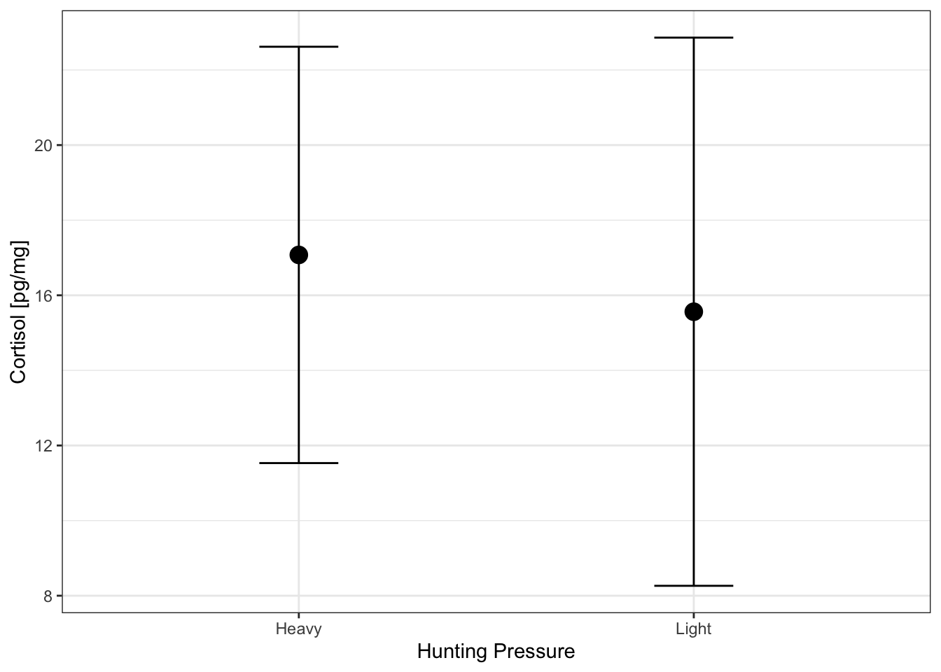
Scatterplots
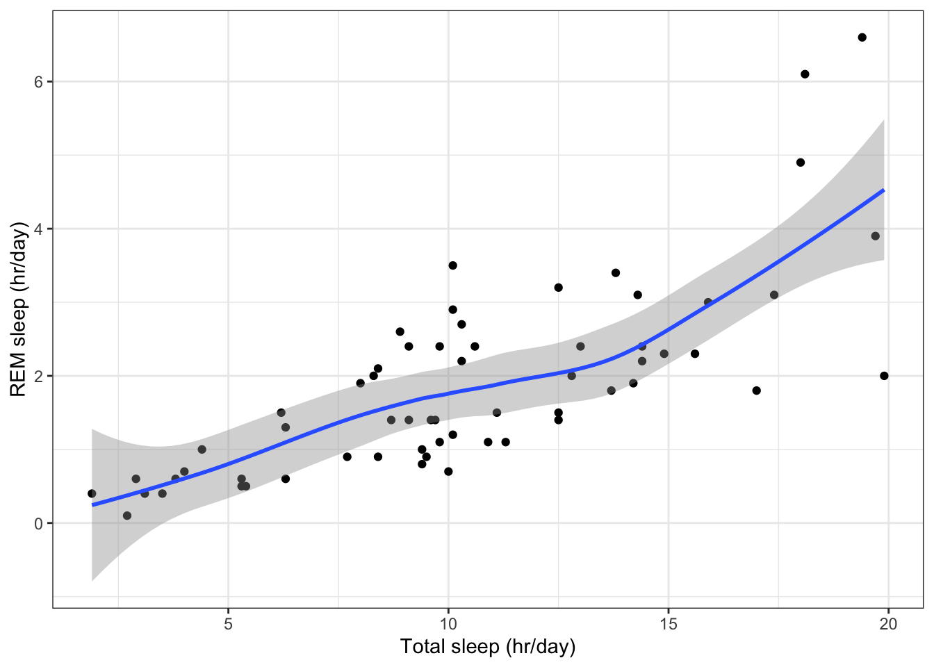
Two quantitative variables can be compared using a scatterplot. Here is an example that plots total time asleep versus time in REM sleep (data from themsleepdata set)
# Plot REM sleep (hours per day) against total sleep (hours per day)
ggplot(data=msleep,                        # Define data to plot
       aes(x=sleep_total,
           y=sleep_rem)) +
  geom_point(na.rm=TRUE) +                 # Draw points
  labs(x='Total sleep (hr/day)',           # Set axis titles
       y='REM sleep (hr/day)') +
  theme_bw()                               # Set the background to white
Adding a smoothed line
Sketching a line through your data point can help your eye visualise the relationship between two continuous variables.
Usingggplot2a smoothed line can be added to a plot usinggeom_smooth(). Below is an example, using the loess smoothing method.
# Adding a smoothed line to the plot using geom_smooth()

ggplot(data=msleep,
       aes(x=sleep_total,
           y=sleep_rem)) +
  geom_point(na.rm=T) +
  geom_smooth(method='loess',na.rm=T) +    # Draw a smoothed line through the points
  labs(x='Total sleep (hr/day)',
       y='REM sleep (hr/day)') +
  theme_bw()                               # Set the background to white
`geom_smooth()` using formula = 'y ~ x'
Note: when drawing a smoothed line, it is import to also visualise the raw data (i.e. the data points). The smooth line helps your eye interpret the data.
Quantitative data continued
Bubble plots
Bubble plots allow three variables to be displayed on one graph. The third variable is the size of a symbol.
Bubble plots were popularised in Hans Rosling’s TED talk
(opens in a new window)Video Tutorial:Hans Rosling using bubble plots (20 mins)
A simple bubble plot can be created usingggplot2and thesize=argument to modify the size of the symbols being plotted.
Below we add information about the body mass of animals (bodywt) to the scatterplot ofsleep_totalversussleep_rem.
# A bubble plot where size of the symbol represents body weight (on a log scale)

# Plot REM sleep (hours per day) against total sleep (hours per day)
ggplot(data=msleep,                               # Define data to plot
       aes(x=sleep_total,
           y=sleep_rem,
           size=bodywt)) +                        # Define size of symbol
  geom_point(na.rm=TRUE) +                        # Draw points (remove NA's)
  scale_size_continuous(name='Body Weight (kg)',  # Define size scale
                        trans='log10') +          # Log10 transform body weight
  labs(x='Total sleep (hr/day)',                  # Set axis titles
       y='REM sleep (hr/day)') +
  theme_bw()                               # Set the background to white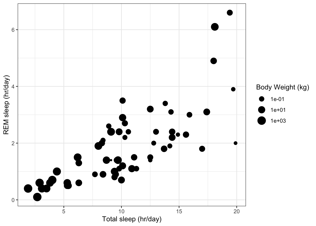
Multiple scatterplots
Multiple scatterplots can be used to visualise correlations within the data set.
Below we plot the sleep data for mammals in themsleepdata frame (data are in columns 6, 7, 8 and 9 corresponding to variablessleep_total,sleep_rem,sleep_cycleandawake) using thepairs()function
pairs(msleep[ ,c(6:9)]) # Display a grid of scatterplots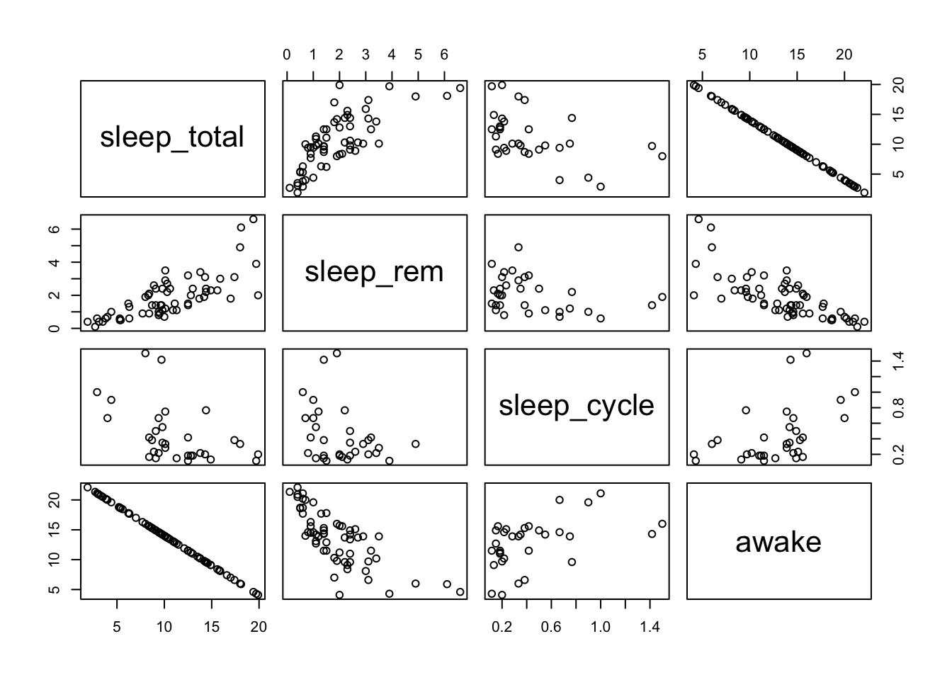
This displays a grid of scatterplots. The top row of plots has thesleep_totalvariable on the y-axis and each of the other variables (sleep_rem,sleep_cycleandawake) on the x-axis. You can see thatsleep_totalandawakeare perfectly correlated (a negative correlation) because these two variables must sum to 24 hours. The plots below the diagonal repeat the plots above the diagonal but with x and y axes swapped.
We can start to see patterns in the data. For example,sleep_totalhas a positive correlation withsleep_rem, whereassleep_cyclehas no clear relationship withsleep_rem.
Styling a ggplot
Logarithmic axes
A linear scale is sally the default scale for the axes of a plot, but a linear scale does not always communicate the data very clearly.
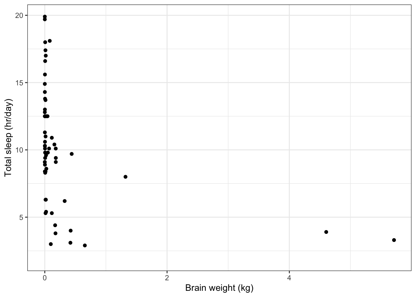
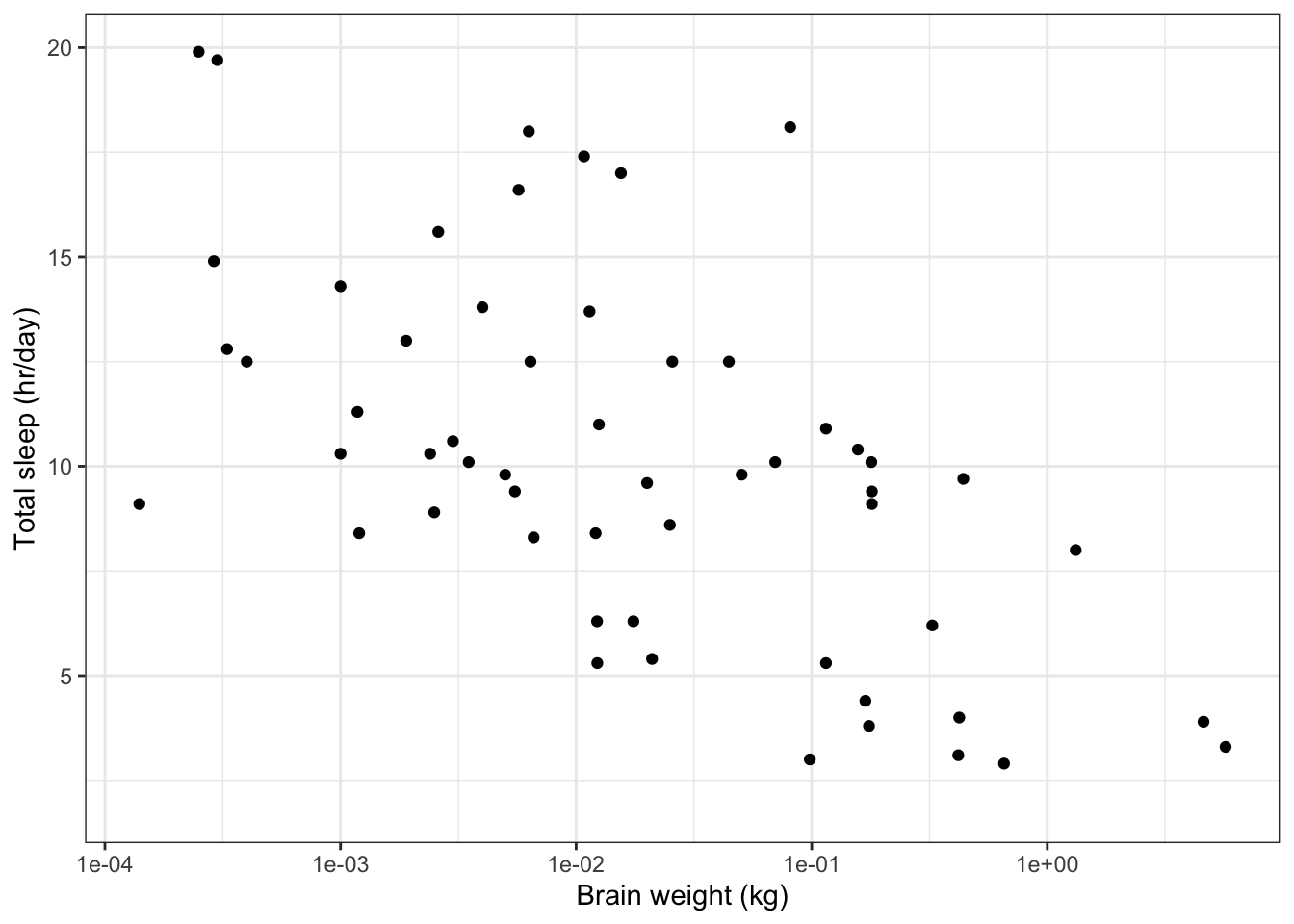
Below we plot a species’ total time asleep as a function of its brain weight. Most of the variation in brain weight is less than 1 kg, but there are a couple of species with large brain weights.
# Plot total time asleep as a function of brain weight
ggplot(data=msleep,                        # Define data to plot
       aes(x=brainwt,
           y=sleep_total)) +
  geom_point(na.rm=T) +                    # Draw points
  labs(x='Brain weight (kg)',              # Set axis titles
       y='Total sleep (hr/day)') +
  theme_bw()                               # Set the background to white
The plot would be clearer if we plotted the x-axis on a scale oforders of magnitude(i.e. on a scale which looks like 1 g, 10 g, 100 g, 1 kg, 10 kg). This kind of scale is alogarithmic scale.
Usescale_x_log10()to convert the x-axis to a logarithmic scale.
# Plot total time asleep as a function of brain weight # using logarithmic x-axis ggplot(data=msleep, aes(x=brainwt, y=sleep_total)) + geom_point(na.rm=T) + labs(x='Brain weight (kg)', y='Total sleep (hr/day)') + scale_x_log10() + # Set x-axis to log scale theme_bw() # Set the background to white
Symbols
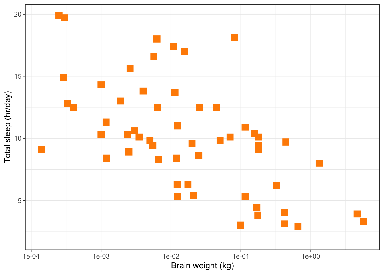
The symbol used to plot a point can be changed by setting theshape=,size=andcolour=arguments ofgeom_point(). Below is an example of a scatter plot using solid squares (shape=15), with a size four times the default (size=4) and coloured dark orange (colour='darkorange'). The list of shape codes are at the end of this tutorial. More details on styling lines and points can be found at(opens in a new window)https://ggplot2.tidyverse.org/articles/ggplot2-specs.html.
# Plot total time asleep as a function of brain weight
# usng logarithmic x-axis

ggplot(data=msleep,
       aes(x=brainwt,
           y=sleep_total)) +
  # Set symbols to be dark orange, filled squares,
  # with a size 4 times larger than the default size
  geom_point(na.rm=T,
             shape=15,
             size=4,
             colour='darkorange') +
  labs(x='Brain weight (kg)',
       y='Total sleep (hr/day)') +
  scale_x_log10()  +
  theme_bw()
Axis titles and fonts
We’ve seen thatlabs()can be used to define the title of each axis. However, the size and font of these titles are set bychanging the theme.
Below is an example where the axis labels and axis titles are set to a size of 18(opens in a new window)pointsand have a serif font family (e.g. Times), set usingfamily='serif'. Axis titles are in abold faceusingface='bold'.
# Plot total time asleep as a function of brain weight
# using logarithmic x-axis and changing font of axis text

ggplot(data=msleep,
       aes(x=brainwt,
           y=sleep_total)) +
  geom_point(na.rm=T) +
  labs(x='Brain weight (kg)',
       y='Total sleep (hr/day)') +
  scale_x_log10() +
  theme_bw()  +
  theme(
    # Font size of axis labels and font family
    axis.text = element_text(size=18,
                             family="serif"),
    # Font of axis title, change size, font family and font face
    axis.title = element_text(size=18,
                              family="serif",
                              face='bold'))
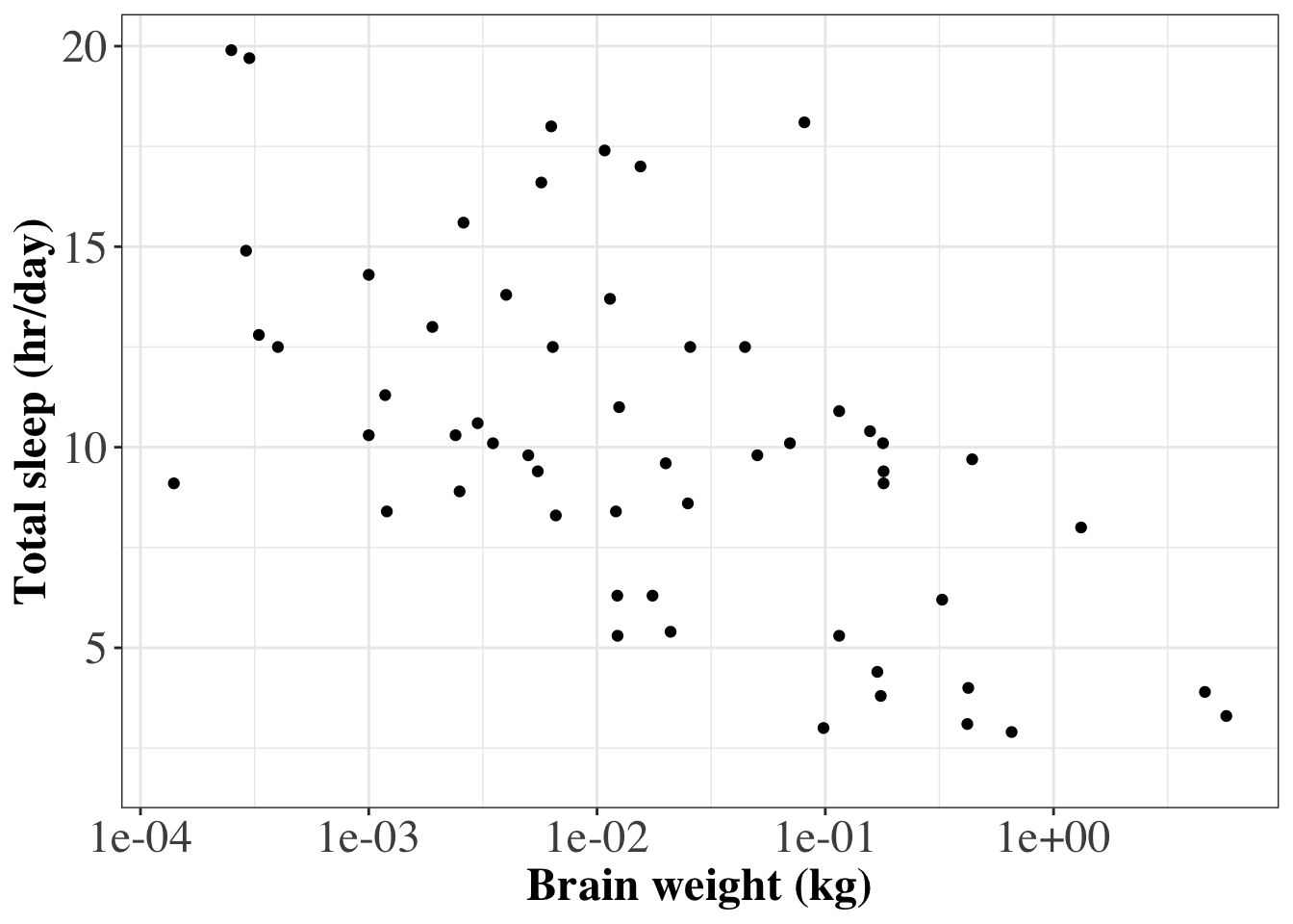
A consistent style can be easily applied to lots of ggplot graphs by defining a custom theme and then applying that theme to every ggplot command. Below is an example of R code that will produce the same plot as above, but the customized style can also be applied to other ggplot graphics.
# **************************************************
# Defining a customized style

# Define a custom style where font size and font face are specified
custom_style = theme(
    # Font size of axis labels and font family
    axis.text = element_text(size=18,
                             family="serif"),
    # Font of axis title, change size, font family and font face
    axis.title = element_text(size=18,
                              family="serif",
                              face='bold'))


# Now produce the plot and add the customized style
ggplot(data=msleep,
       aes(x=brainwt,
           y=sleep_total)) +
  geom_point(na.rm=T) +
  labs(x='Brain weight (kg)',
       y='Total sleep (hr/day)') +
  scale_x_log10() +
  theme_bw()  +
  custom_style                      # Apply custom style to the plot

We can use thescalespackage to format the labels on the x-axis into publication quality (i.e. from1e-03to 10-3).
# Plot total time asleep as a function of brain weight
# make x-axis labels nicely formatted

ggplot(data=msleep,
       aes(x=brainwt,
           y=sleep_total)) +
  geom_point(na.rm=T) +
  labs(x='Brain weight (kg)',
       y='Total sleep (hr/day)') +
  scale_x_log10(
    # Set x-axis tick mark positions
    breaks = scales::trans_breaks("log10", function(x) 10^x),
    # Set x-axis labels to be nicely formatted
    labels = scales::trans_format("log10", scales::math_format(10^.x))) +
  theme_bw() +

Colour scales
We can use colour scales to represent additional information.
Discrete colour scales
A great resource for picking informative colour scales that are discrete is(opens in a new window)http://colorbrewer2.org.
We can add information about the different feeding types (variablevorewith levelsherbi,omni,carniandinsecti) to the plot of total sleep time versus REM sleep time, by using a discrete colour scale with the symbols.
First we’ll define labels that will be used in the plot’s legend.
# Plot feeding types using different colours

# Define labels for the bars
labs = c('herbi'='Herbivore',
         'carni'='Carnivore',
         'omni'='Omnivore',
         'insecti'='Insectivore')
Then we’ll set the colour scale to the feeding type bycolour=vorein the aesthetics. Finally, the colour palette and labels can be set usingscale_colour_discrete().
# Plot REM sleep (hours per day) against total sleep (hours per day)
# Use different coloured points for different feeding types

# Define a custom style where font size and font face are specified
# for axis and legend text
custom_style = theme(
    # Font size of axis labels and font family
    axis.text = element_text(size=18),
    # Font of axis title, change size, font family and font face
    axis.title = element_text(size=18,
                              face='bold'),
    legend.text = element_text(size=16),
    legend.title = element_text(size=16))


# Now produce the ggplot graphics with the custom style
ggplot(data=msleep,                               # Define data to plot
       aes(x=sleep_total,
           y=sleep_rem,
           colour=vore)) +                        # Symbol colour given by variable vore
  geom_point(na.rm=TRUE, size=2) +
  scale_colour_discrete(name = 'Feeding Type',    # Name the colour scale
                        labels=labs) +            # Set labels for the legend
  labs(x='Total sleep (hr/day)',
       y='REM sleep (hr/day)') +
  theme_bw() +


  custom_style                                    # Use custom style defined earlier
custom_style
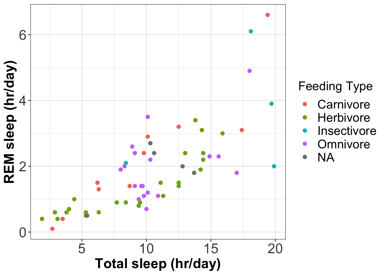
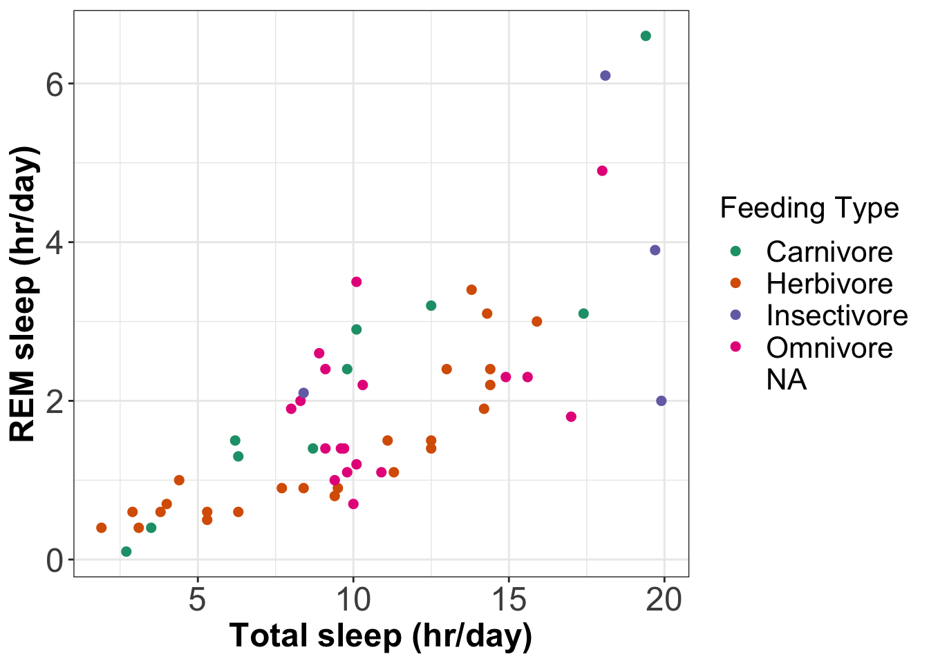
The above plot uses the default colour palette. To use(opens in a new window)colorbrewer paletteswe can usescale_colour_brewer().
# Plot REM sleep (hours per day) against total sleep (hours per day)
# Use different coloured points for different feeding types
# Use www.colorbrewer2.org colour palette
ggplot(data=msleep,                               # Define data to plot
       aes(x=sleep_total,
           y=sleep_rem,
           colour=vore)) +                        # Symbol colour given by variable vore
  geom_point(na.rm=TRUE, size=2) +
  scale_colour_brewer(name = 'Feeding Type',      # Name the colour scale
                      labels=labs,                # Set labels for the legend
                      palette = 'Dark2') +        # Use colorbrewer palette Dark2
  labs(x='Total sleep (hr/day)',
       y='REM sleep (hr/day)') +
  theme_bw()  +
Continuous colour scales
The(opens in a new window)viridiscolour palettes are good colours to use for continuous scales.
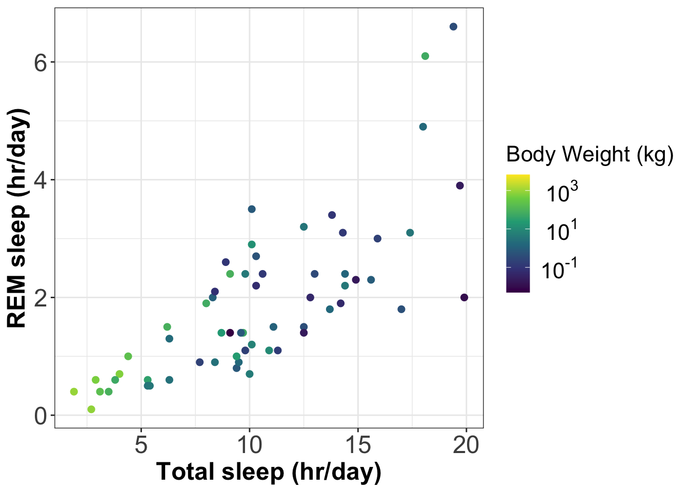
Below we add information about body weight to the plot of total sleep time versus REM sleep. We do this using symbol colour on a continuous scale. This becomes a coloured version of the bubble plot.
We usescale_colour_viridis_c()to add a continuous colour scale using a viridis palette.
# A bubble plot where size of the symbol represents body weight (on a log scale)
# and symbol colour represents body weight (on a log scale)
# Plot REM sleep (hours per day) against total sleep (hours per day)
ggplot(data=msleep, # Define data to plot
aes(x=sleep_total,
y=sleep_rem,
colour=bodywt)) + # Use colour scale for body weight
geom_point(na.rm=TRUE, size=2) +
# Use viridis default palette
scale_color_viridis_c(name='Body Weight (kg)',
trans='log10',
# Set x-axis labels to be nicely formatted
labels = scales::trans_format("log10",scales::math_format(10^.x))) +
labs(x='Total sleep (hr/day)',
y='REM sleep (hr/day)') +
theme_bw() +
custom_style custom_style Making figures accessible to all
Make your visualisation have a big impact on people by making them accessible to as many people as possible.
When producing visualisations be aware that different people will see your visualisations differently. Some examples of reasons for perceptual differences are:
- Viewing a black & white print out of your visualisation
- Colour blindness:(opens in a new window)https://www.nature.com/articles/d41586-021-02696-z
- People with low vision often magnify images. Magnified images can appear pixelated and hard to understand if they are too low resolution.
Google have come up with some nice visualisation design principles:(opens in a new window)https://medium.com/google-design/redefining-data-visualization-at-google-9bdcf2e447c6
Saving a plot as an image file
Using RStudio
If you are using RStudio you can use its GUI to save graphical output to a file. Here is a short video tutorial on this:
Video Tutorial:Saving R graphics to a file using RStudio (3 mins)
Using ggplot2
To save a plot to a file you can use theggsave()command. Here is the code to save the coloured bubble plot (above).
# Save the figure to a file
ggsave(filename = 'coloured_plot.png',      # Set filename
       width=8,                             # Set width (inches)
       height=5)                            # Set height (inches)
More visualisation ideas
We give some examples of more advanced data visualisation techniques that use packages such asggplot2. We will present the visualisations but not the R code.
Violin plots
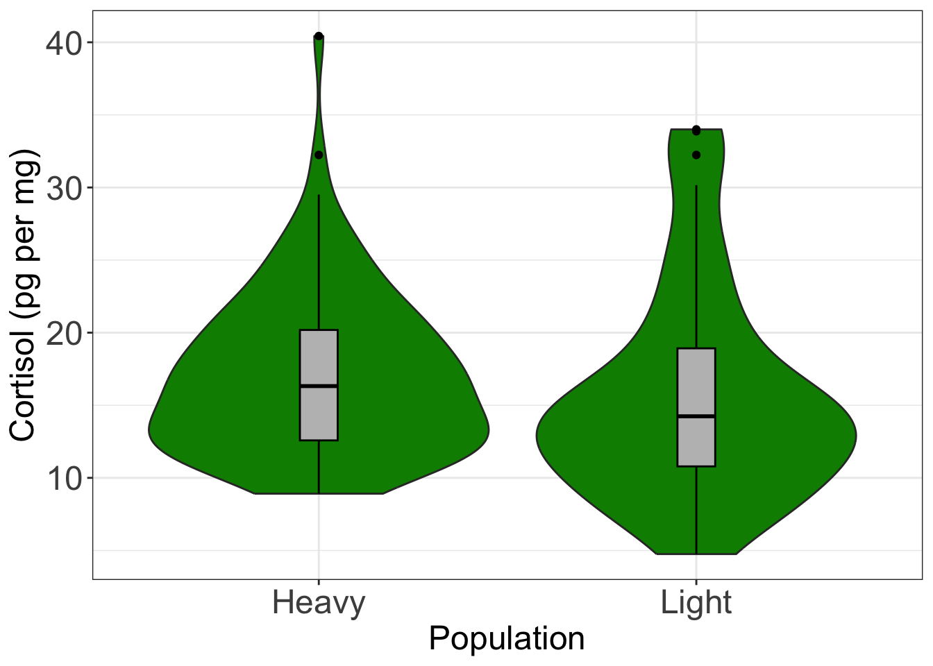
Violin plots are similar to boxplots, but the boxes are replaced by violin shapes that represent the distribution of the data. Below is the violin plot version of the boxplot above for cortisol in populations 1 & 2 (this violin plot was produced using packageggplot2). The boxplot version is also shown in grey inside each violin.
# Create a violin plot and overlay a box and whiskers plot


# Define axis label and title font size to be 18
format = theme(axis.title = element_text(size=18),
               axis.text = element_text(size=18))

ggplot(data=wolf.sub,           # Define data to plot
       aes(x=Hunting,
           y=Cpgmg)) +
  geom_violin(fill='green4') +  # Draw violin plot in green
  geom_boxplot(colour='black',  # Draw box and whiskers plot
               fill='grey',
               width=0.1) +
  theme_bw() +                  # Set background to white
  format +                      # Set the look of the plot
  labs(x='Population',          # Set axis titles
       y='Cortisol (pg per mg)')
Heatmaps
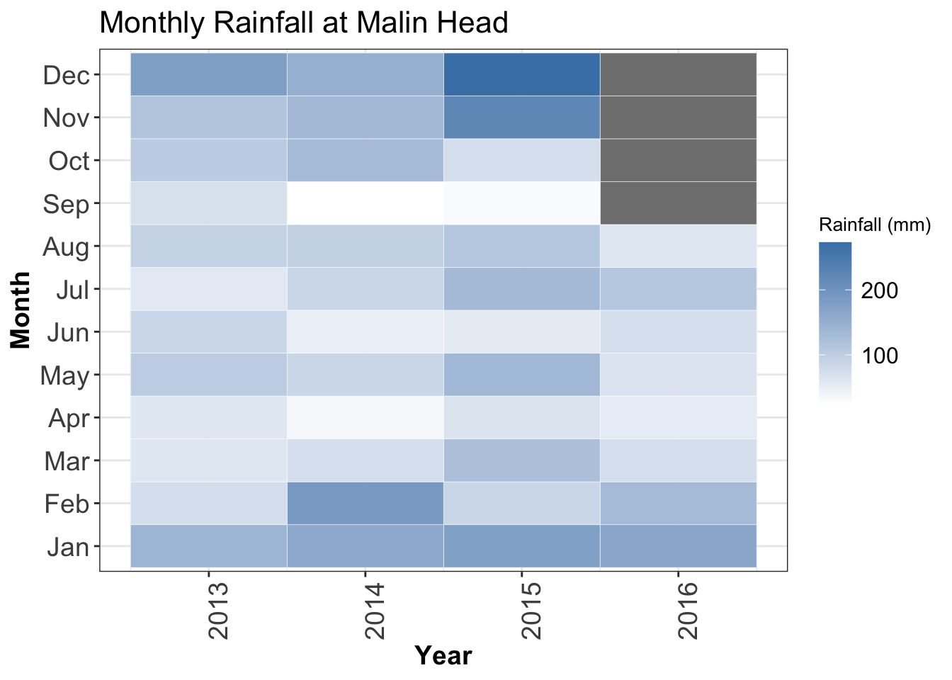
A heatmap represents three variables as a coloured matrix: two qualitative variables on the x and y axes and a third variable as a colour. They are commonly used in biology (e.g. gene expression data). You can create these plots using the functionheatmap().
Below is a heatmap showing the monthly rainfalls at Malin Head from 2013 - 2016 (produced usingggplot2).
## Heatmap code
library(tidyr)
library(ggplot2)
# Import rainfall data
rainfall = read.table('MALIN_HEAD.TXT', header=T, sep='\t')

# Create an array of the months in chronological order
monthList = c('Jan','Feb','Mar','Apr','May','Jun',
              'Jul','Aug','Sep','Oct','Nov','Dec')

# Put rainfall data in long format
rainfall_long = pivot_longer(data=rainfall,
                             names_to = 'Month',
                             values_to = 'rain',
                             cols = any_of(monthList))

# Define the order of the months
rainfall_long$Month = ordered(rainfall_long$Month,
                              levels=monthList)

# Create the heatmap plot
ggplot(data=rainfall_long,
       aes(x=Year,
           y=Month,
           fill=rain)) +
  geom_tile(colour='white') +
  scale_fill_gradient(low = "white",
                      high = "steelblue") +
  labs(x="Year",
       y="Month",
       fill = "Rainfall (mm)",
       title="Monthly Rainfall at Malin Head") +
  theme_bw() +
  theme(legend.title = element_text(size = 10),
        legend.text = element_text(size = 12),
        plot.title = element_text(size=16),
        axis.title=element_text(size=14, face="bold"),
        axis.text = element_text(size=14),
        axis.text.x = element_text(angle = 90, hjust = 1))
Correlation plot
Correlations can be calculated using thecor()function (see above). Heatmaps style visualisations are a great way to visualise correlations.
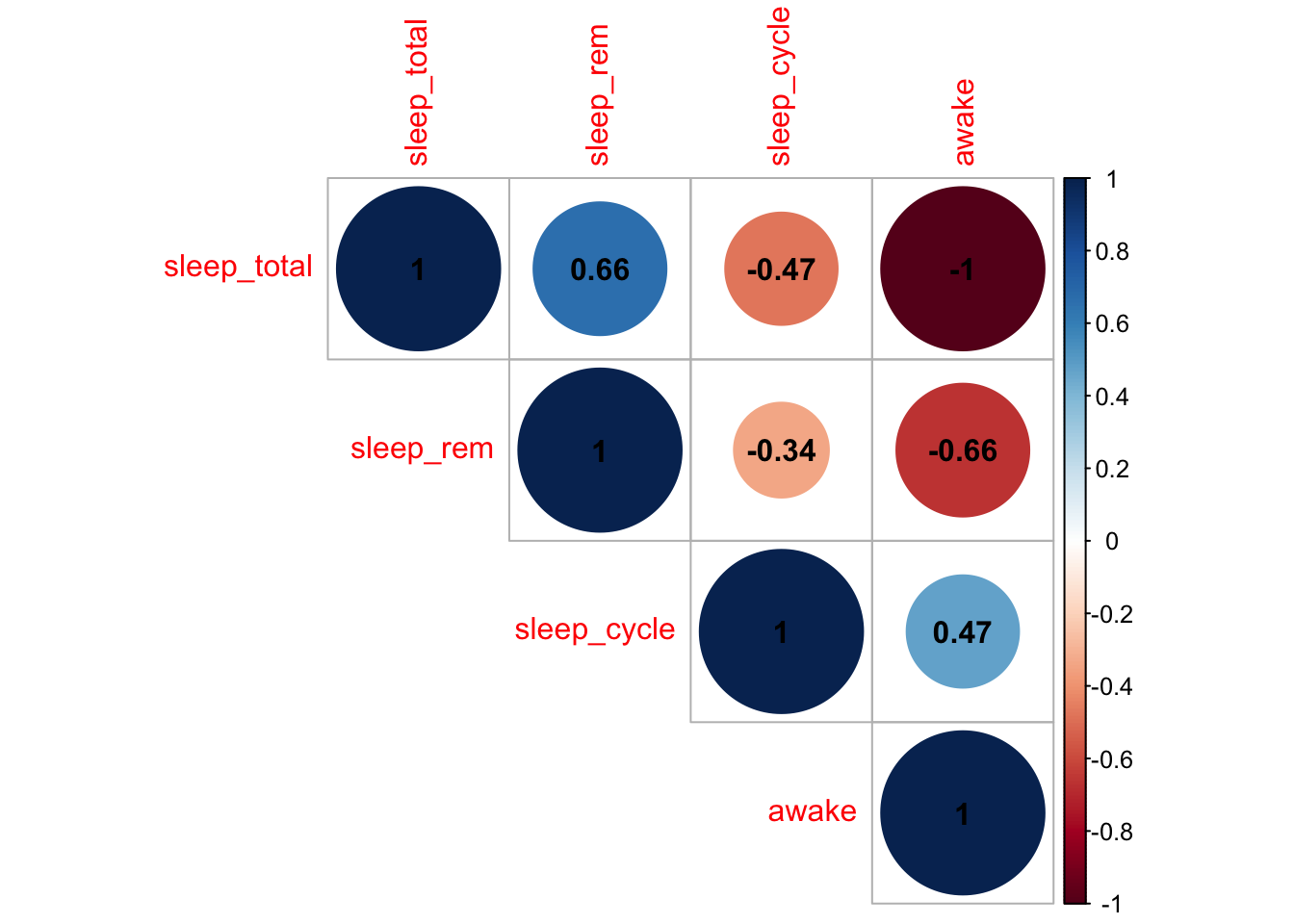
The packagecorrplotprovides a nice way to produce a correlation plot. Below is an example showing the correlations in themsleepdata set (compare this plot to thepairs()scatterplot above).
# Display a correlation plot using the corrplot package

library(corrplot)

# First calculate correlation coefficients to be visualised
cor_matrix = cor(msleep[ ,c(6:9)], method='pearson',use='complete.obs')

# Now produce the plot
corrplot(cor_matrix, method='circle', type='upper', addCoef.col = "black")
Positive correlations are represented in blue, negative correlations in red. The colour scale is shown on the right hand side.
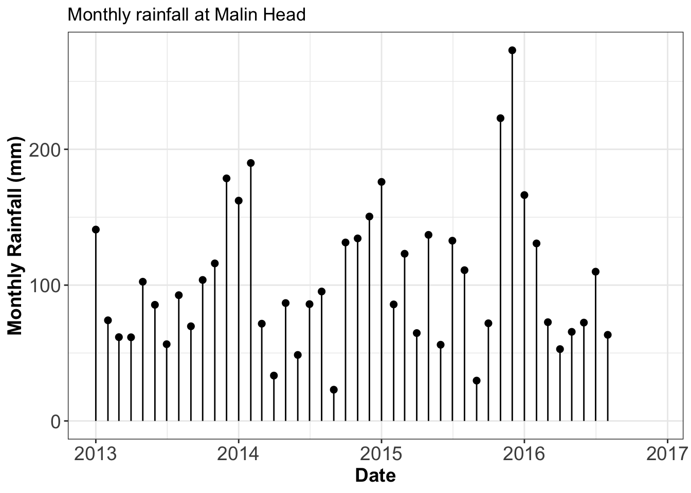
Lollipop plot
This is a mix of a bar plot and a scatter plot.
Below is a lollipop plot for the mean monthly rainfall at Malin Head.
Interactive (HTML) visualisation
Displaying data in a browser (like a webpage in a web browser) allows you to interact with the visualisation. It is a great way to explore data, and it is becoming and increasingly popular data visualisation approach.
Interactive visualisations are not a good way to produce figures for a report, because a report is generally a static document.
There are a range of packages that allow you to produce interactive visualisation that you can view in a browser. Some of these packages are:
- googleVis:(opens in a new window)https://cran.r-project.org/web/packages/googleVis/vignettes/googleVis_examples.html
- plotly:(opens in a new window)https://plot.ly/r/
- leaflet:(opens in a new window)https://rstudio.github.io/leaflet/
- rCharts:(opens in a new window)https://ramnathv.github.io/rCharts/
Example interactive plots:Click here to see some examples of interactive plots
This webpage can be viewed athttps://www.ucd.ie/ecomodel/Resources/interactive_plots_WebVersion.html
Inspirational websites
Here are some webpages with examples of data visualisation using R
Summary of the topics covered
- Accessing R’s built-in data sets
- Descriptive statistics
- Contingency tables
- Basic graphics functions: scatterplots, box and whisker plots, histograms, bar plots, pie charts, Q-Q plots
- Customising graphs: axis labels, symbols and colours
- Saving a graph as an image file
Further Reading
All these books can be found in UCD’s library
- Andrew P. Beckerman and Owen L. Petchey, 2012Getting Started with R: An introduction for biologists(Oxford University Press, Oxford) [Chapter 4]
- Mark Gardner, 2012Statistics for Ecologists Using R and Excel(Pelagic, Exeter) [Chapters 4, 6]
- Michael J. Crawley, 2015Statistics : an introduction using R(John Wiley & Sons, Chichester) [Chapter 2, 3]
- Tenko Raykov and George A Marcoulides, 2013Basic statistics: an introduction with R(Rowman and Littlefield, Plymouth)
- John Verzani, 2005Using R for introductory statistics(Chapman and Hall, London) [Chapters 1, B, D]
Appendix: codes for plotting symbols
Below are the codes corresponding to different symbols.
In ggplot2 these codes are used withshape=option.
In R’s base plotting functions, these codes are used withpch=option.
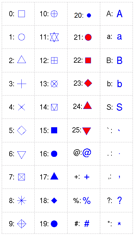
pch=0,square
pch=1,circle
pch=2,triangle point up
pch=3,plus
pch=4,cross
pch=5,diamond
pch=6,triangle point down
pch=7,square cross
pch=8,star
pch=9,diamond plus
pch=10,circle plus
pch=11,triangles up and down
pch=12,square plus
pch=13,circle cross
pch=14,square and triangle down
pch=15, filled square blue
pch=16, filled circle blue
pch=17, filled triangle point up blue
pch=18, filled diamond blue
pch=19,solid circle blue
pch=20,bullet (smaller circle)
pch=21, filled circle red
pch=22, filled square red
pch=23, filled diamond red
pch=24, filled triangle point up red
pch=25, filled triangle point down red
